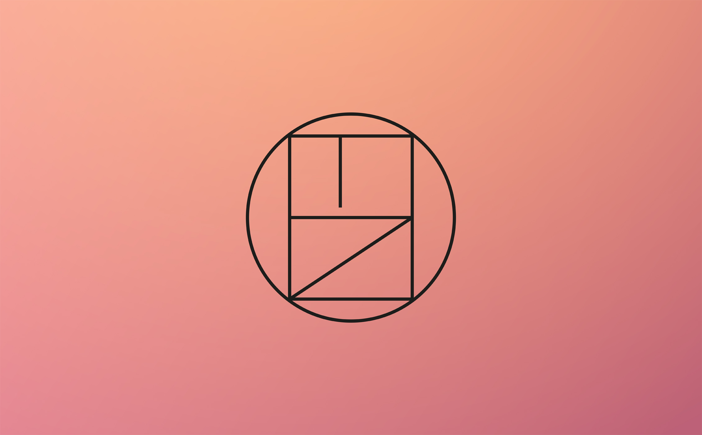
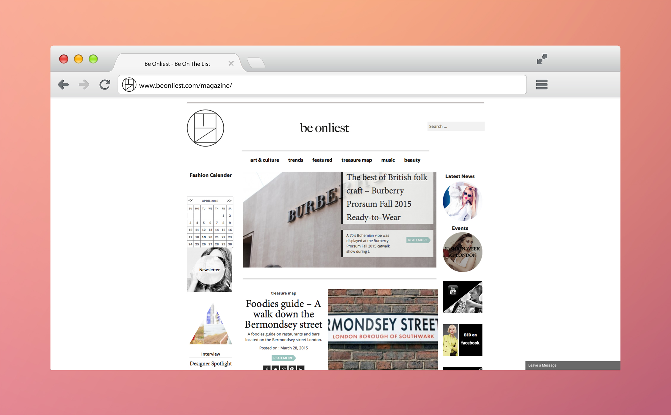
BeOnliest was created by simultaneously keeping in mind the initial references of luxurious, classy and subtle, but also wanting to embrace a distinctively memorable identity as well as an ornamented logotype. The circular symbol was created using the letters of the homonymous BeOnliest. The website and blog followed the same minimalistic path making use of geometrical shapes in a continuum of the brand's visuals.
Born on the same day, but a few years apart from the American gangster Meyer Lansky, Evan Baul (like bawl) is a double fraud and a multidisciplinary designer.