


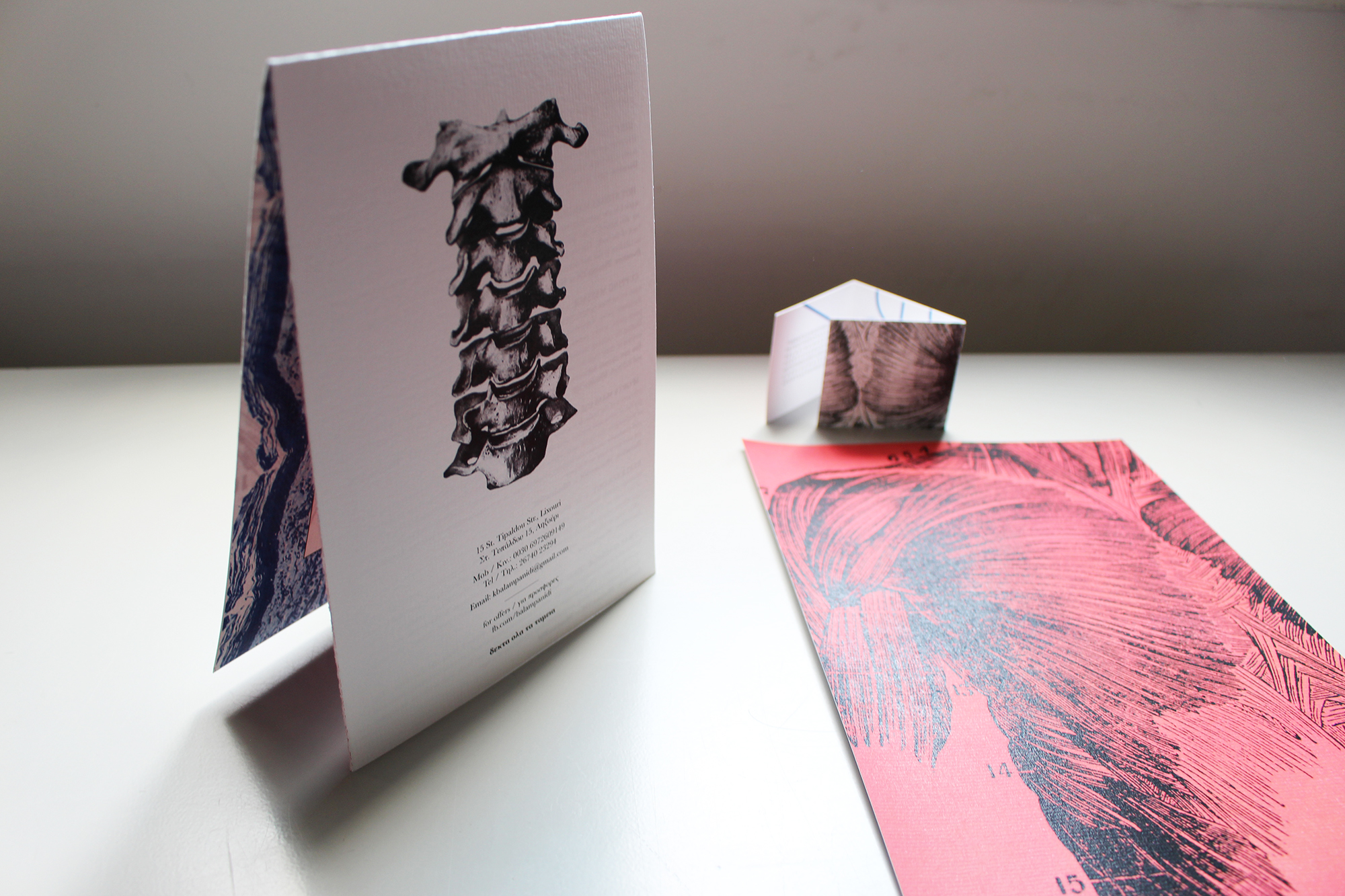
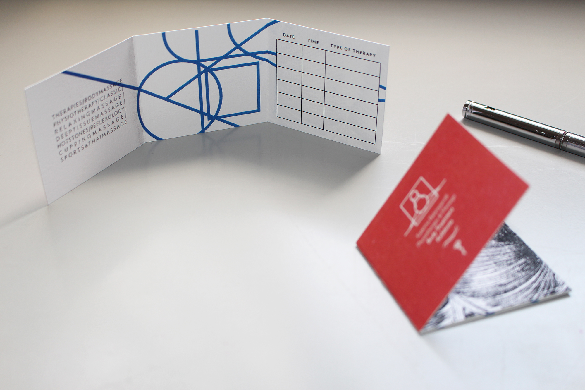

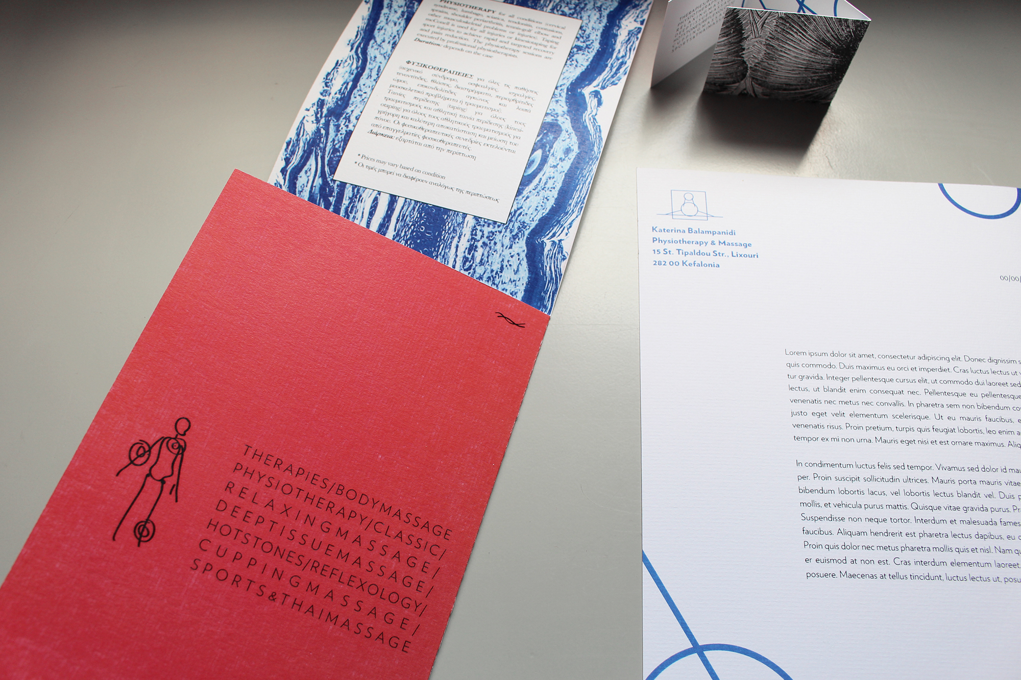

Body Treatment Kefalonia is characterised by simplicity and minimalism which were the key factors to start with and finish Katerina's professional identity. A clean approach throughout made the final results look coherent and that of a reliable, medical space rather than a corporate business; the clinical blue and the warm coral are the prime colours with earthly brown to follow as the secondary, supportive colour that also went onto the interior walls. The logo mark was the ideation of an interactive patient-physiotherapist system of postures I took reference upon whilst having observed Katerina working in her space from different angles. This allowed for the logotype to form and then playing with the typography the second geometrical shape came along to symbolise the muscle knots, a frequently occurring problem a lot of people suffer from.
