BRANDING      EDITORIAL     ILLUSTRATIONS      VISUAL POETRY      POSTERS     VIDEO     LEARNING       


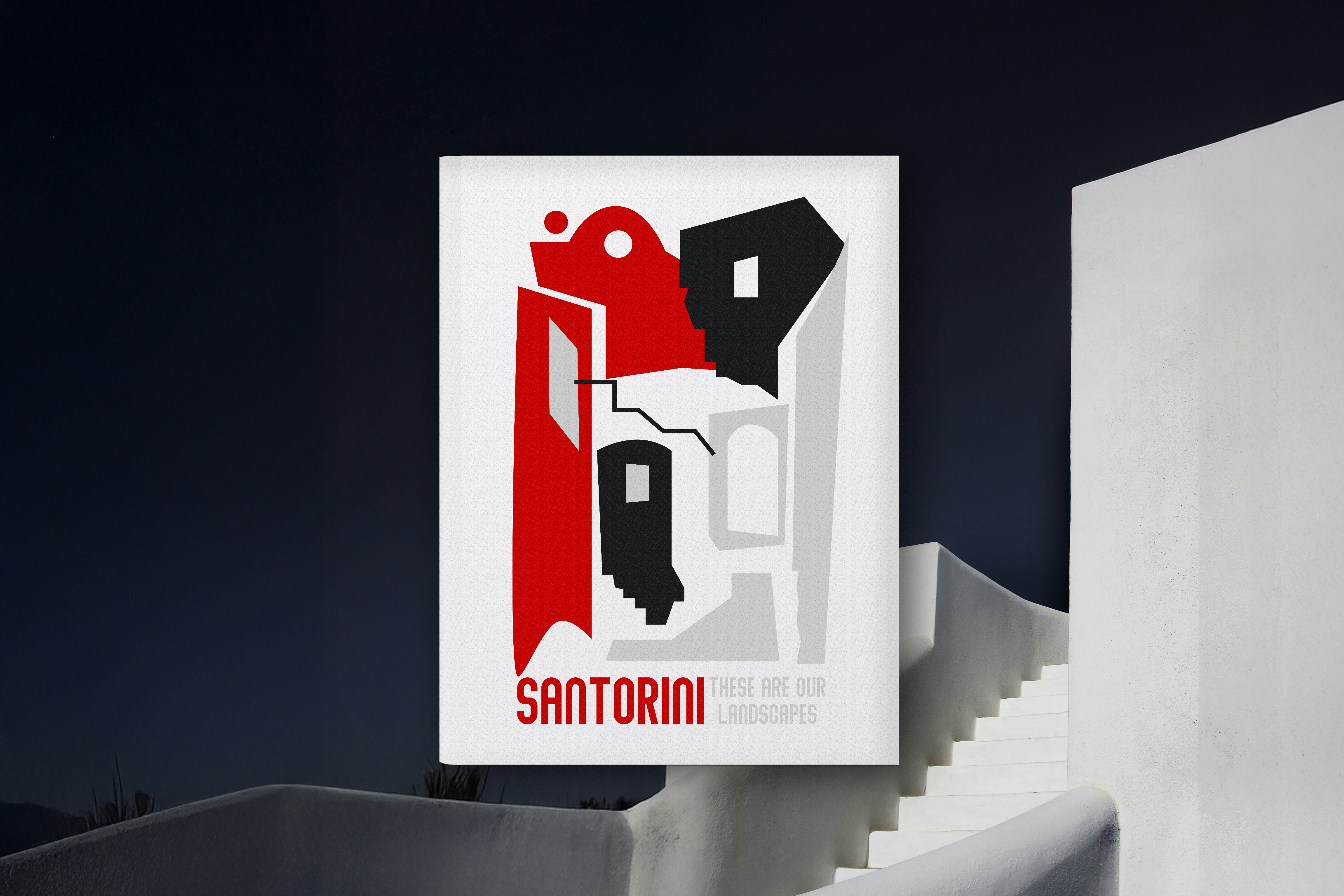
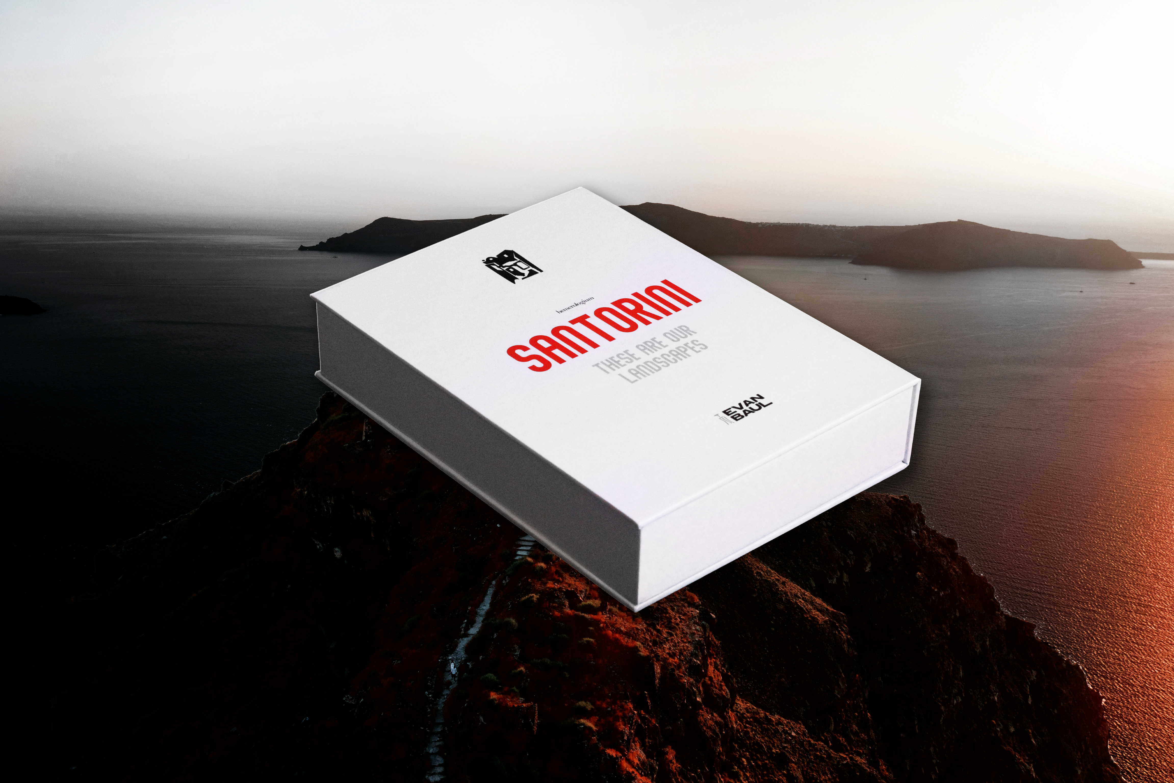
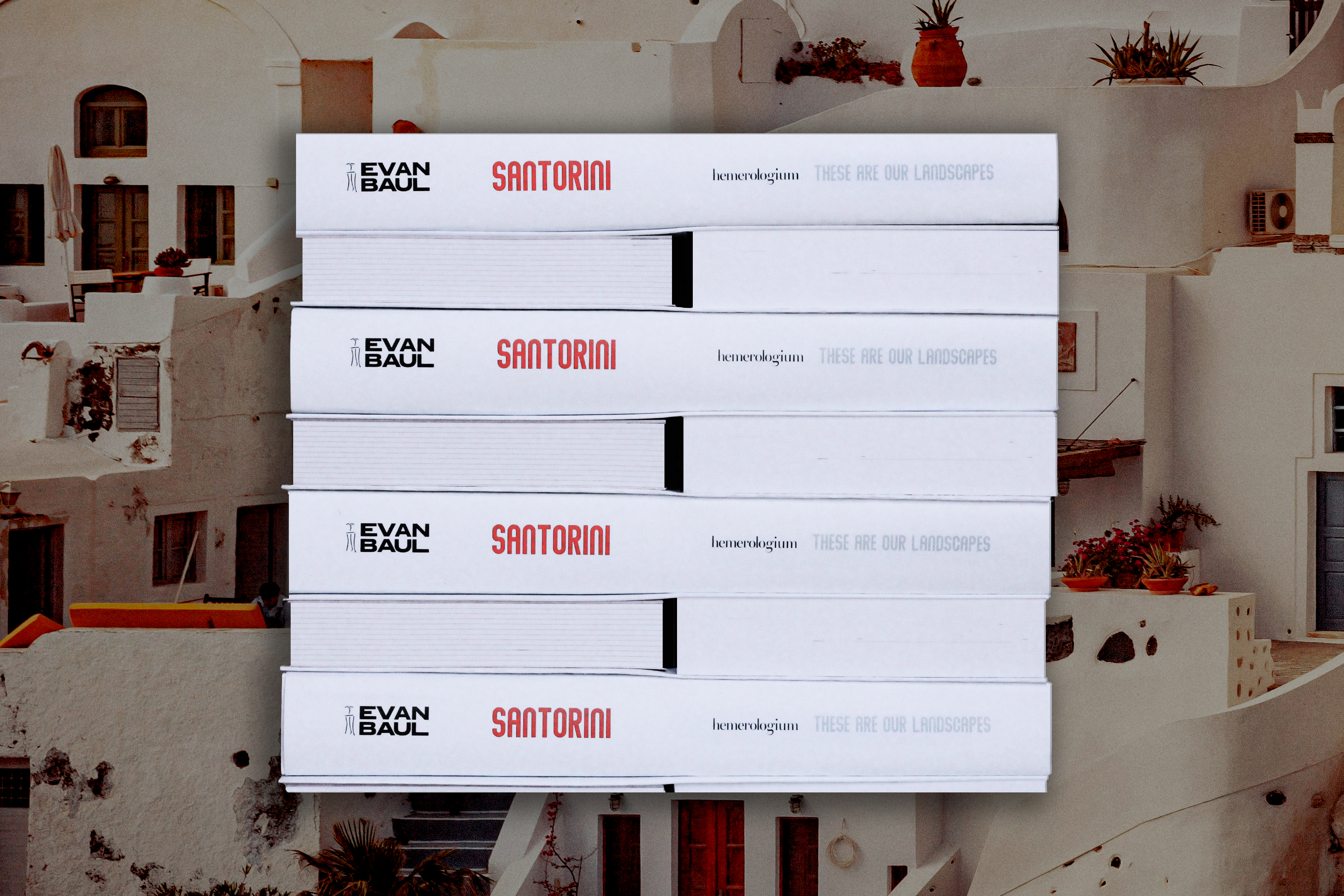
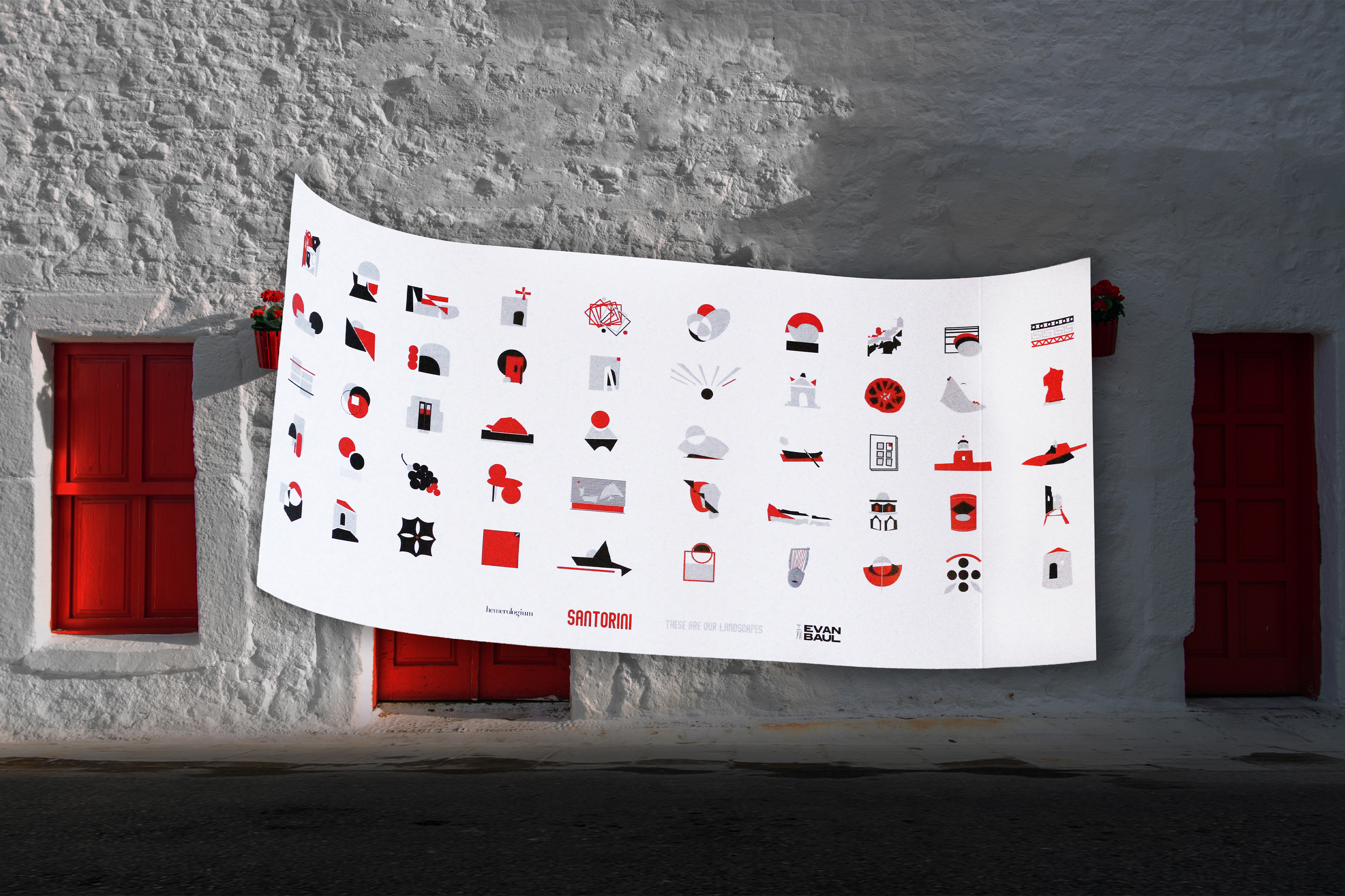
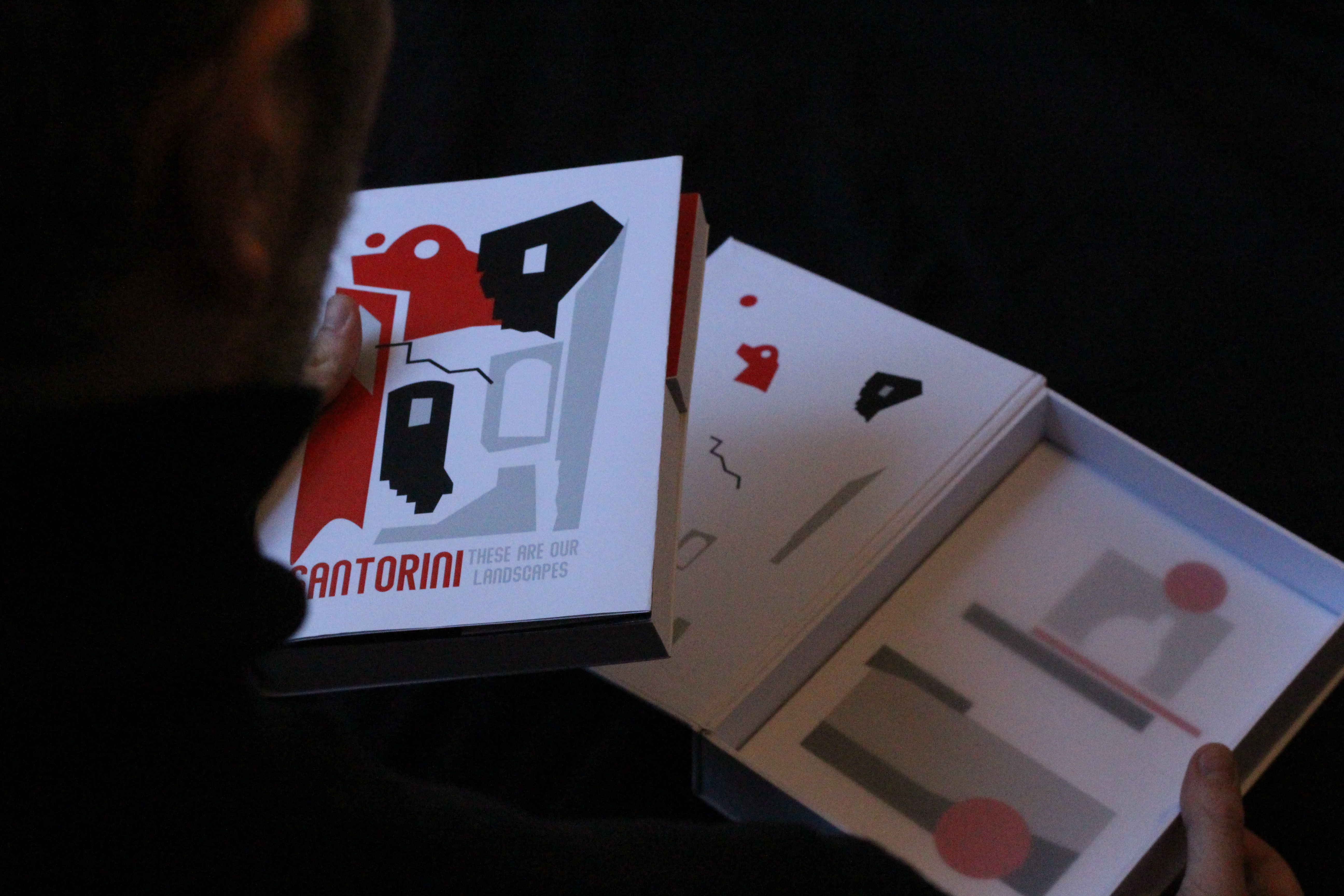
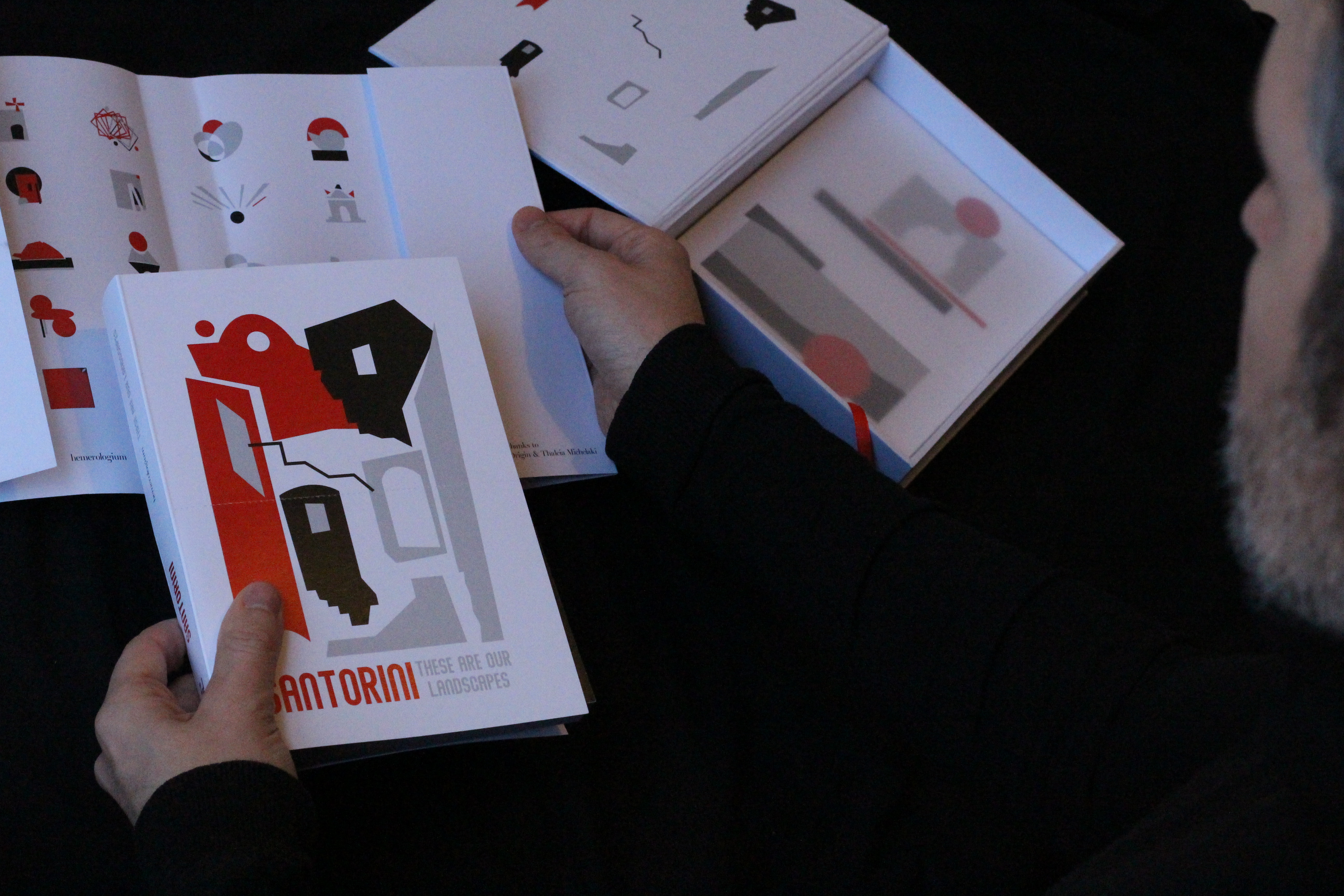
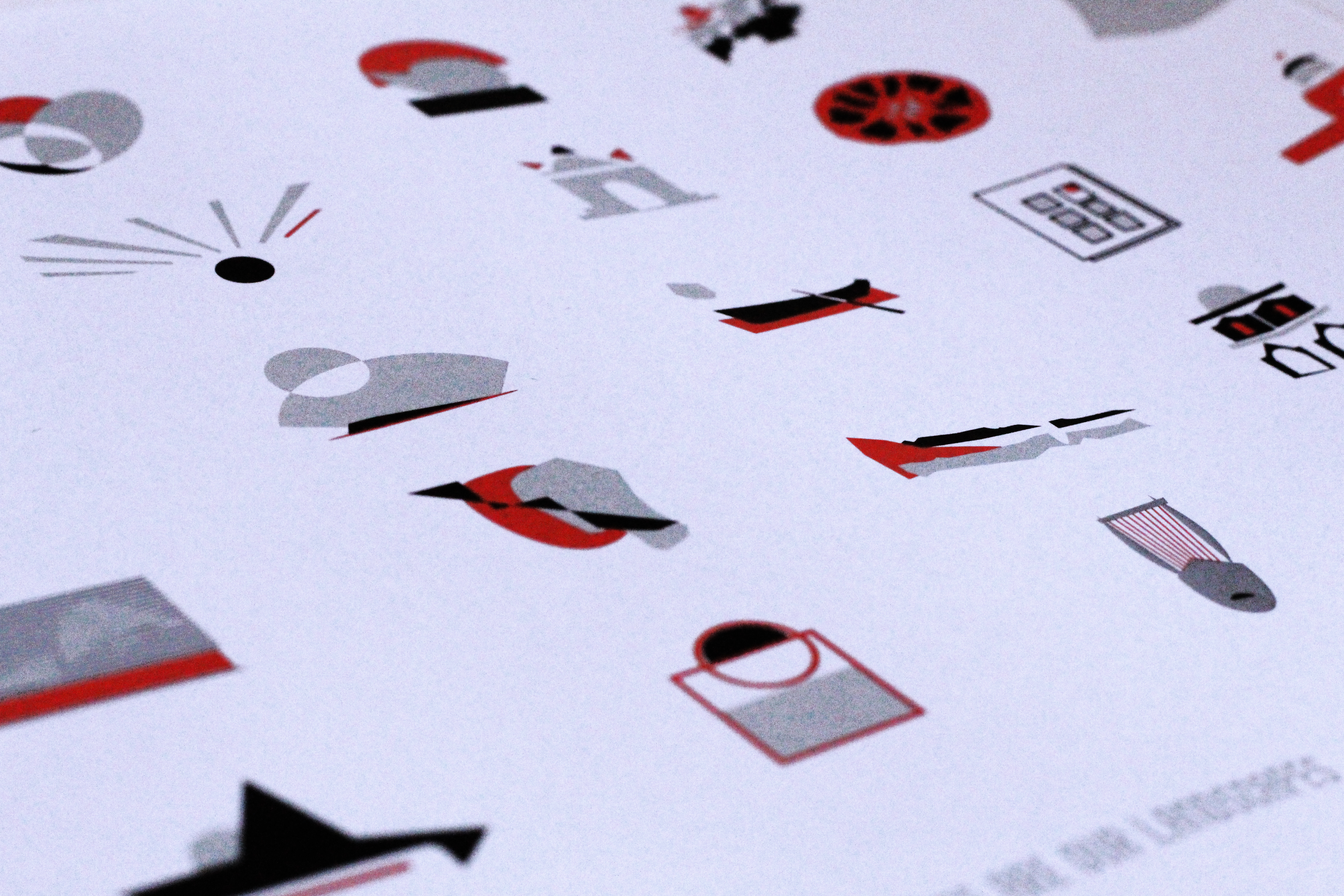
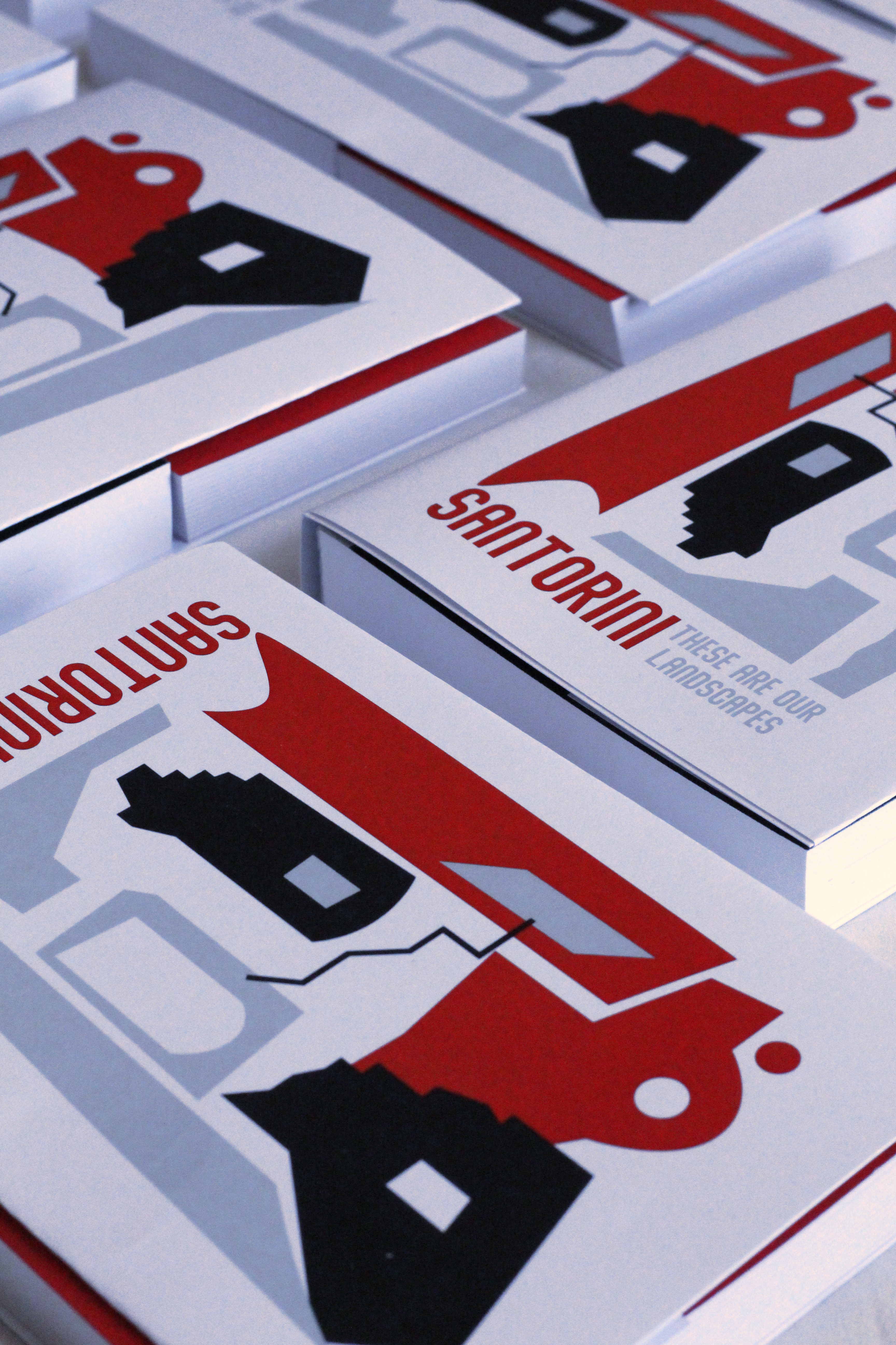
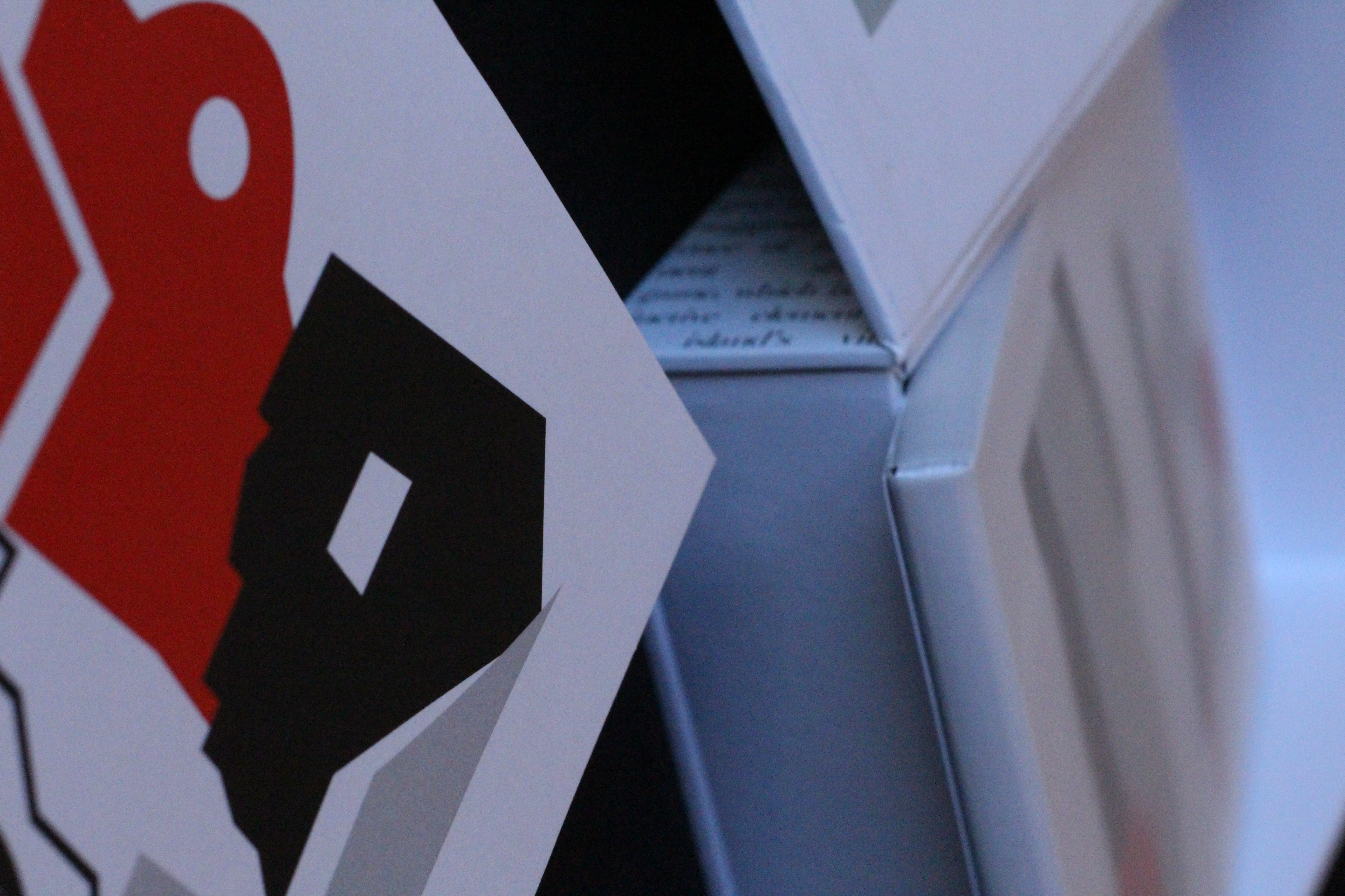
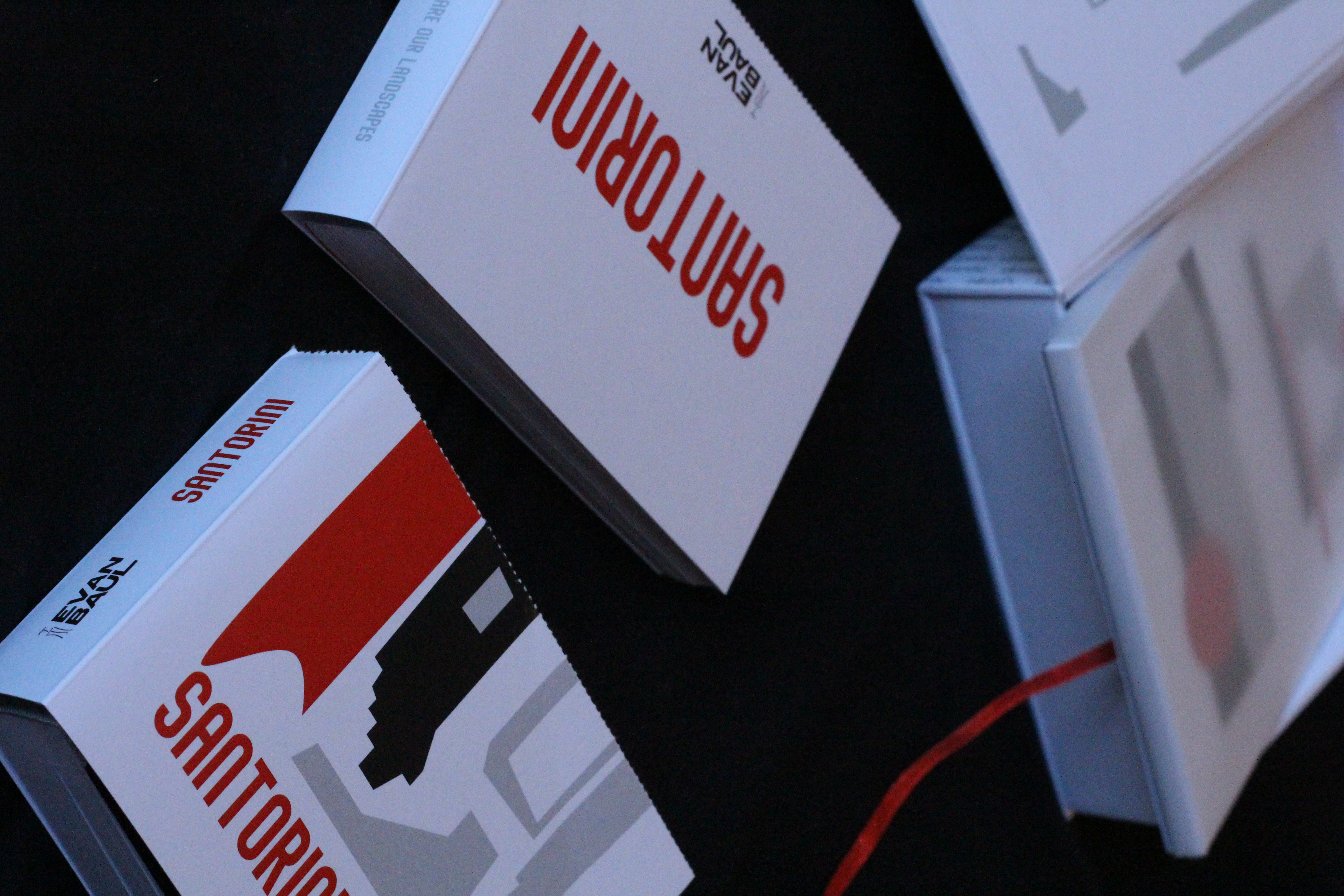
“These are our landscapes” under the sub-line “Santorini” is a project that studies and focuses on the island’s history, mythology, ancient musical instruments and the world-famous, idyllic evening/night views, trying to create an identity out of the ordinary, shaping a bold character beyond the expected blue and white for the popular island and its branding.

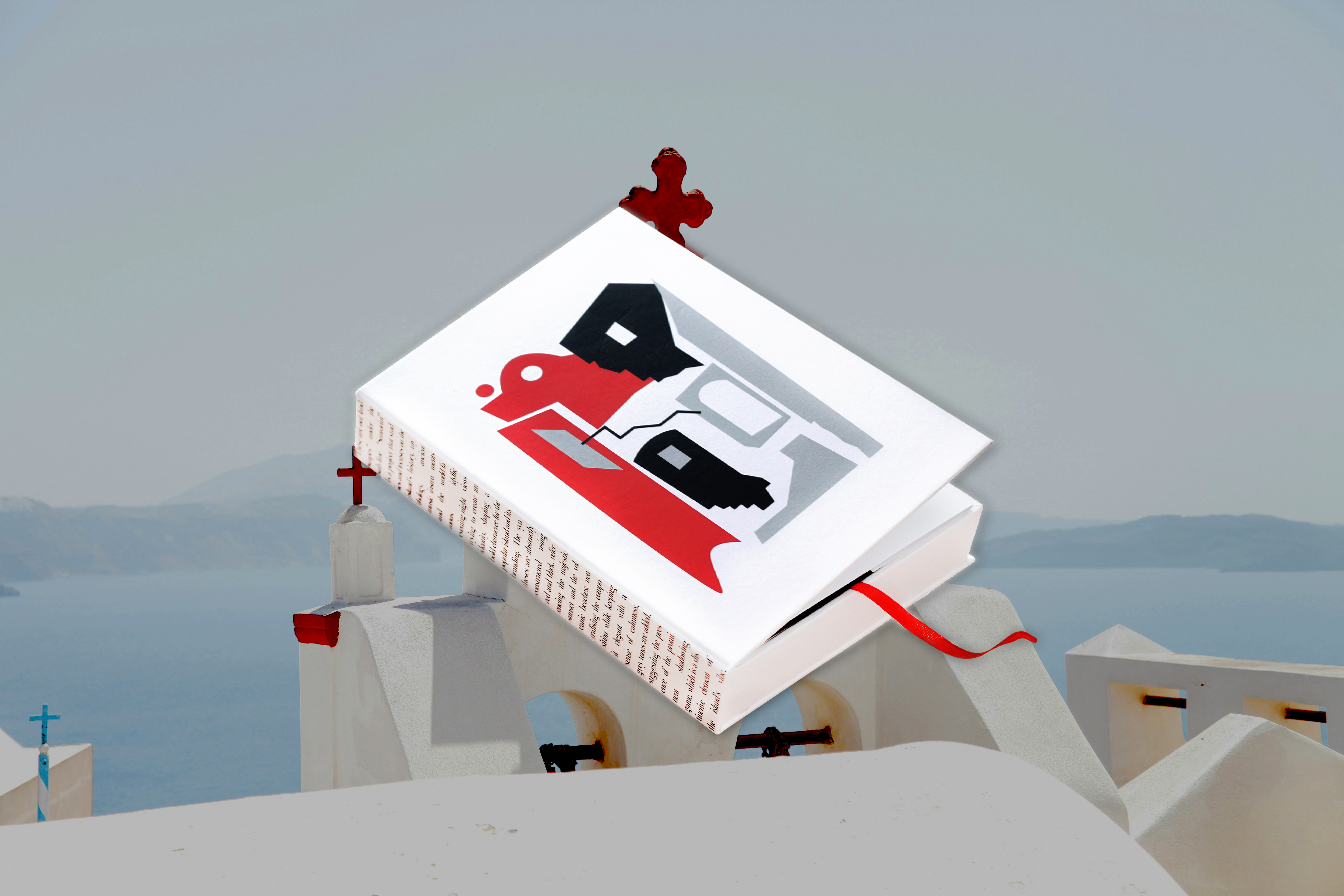
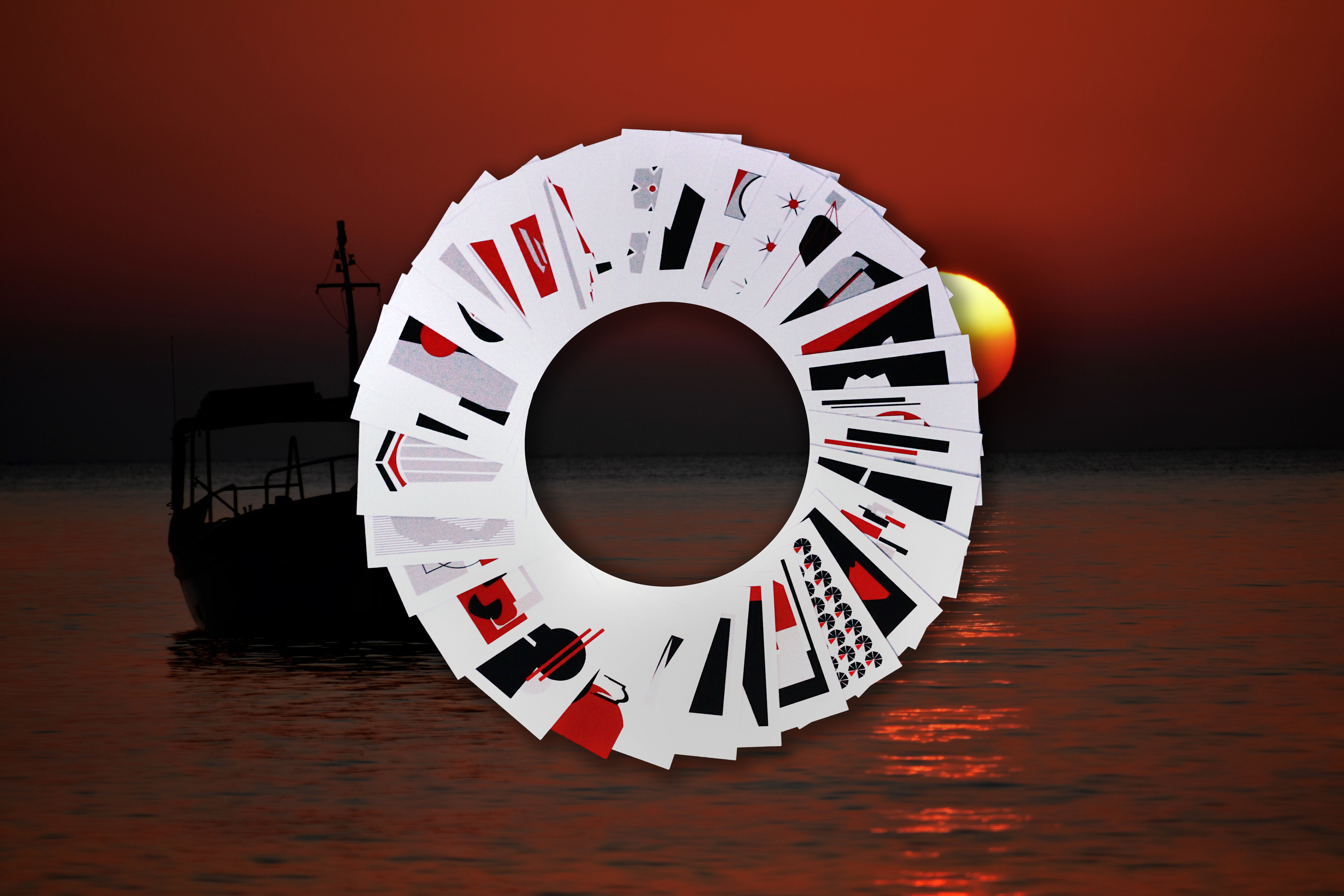
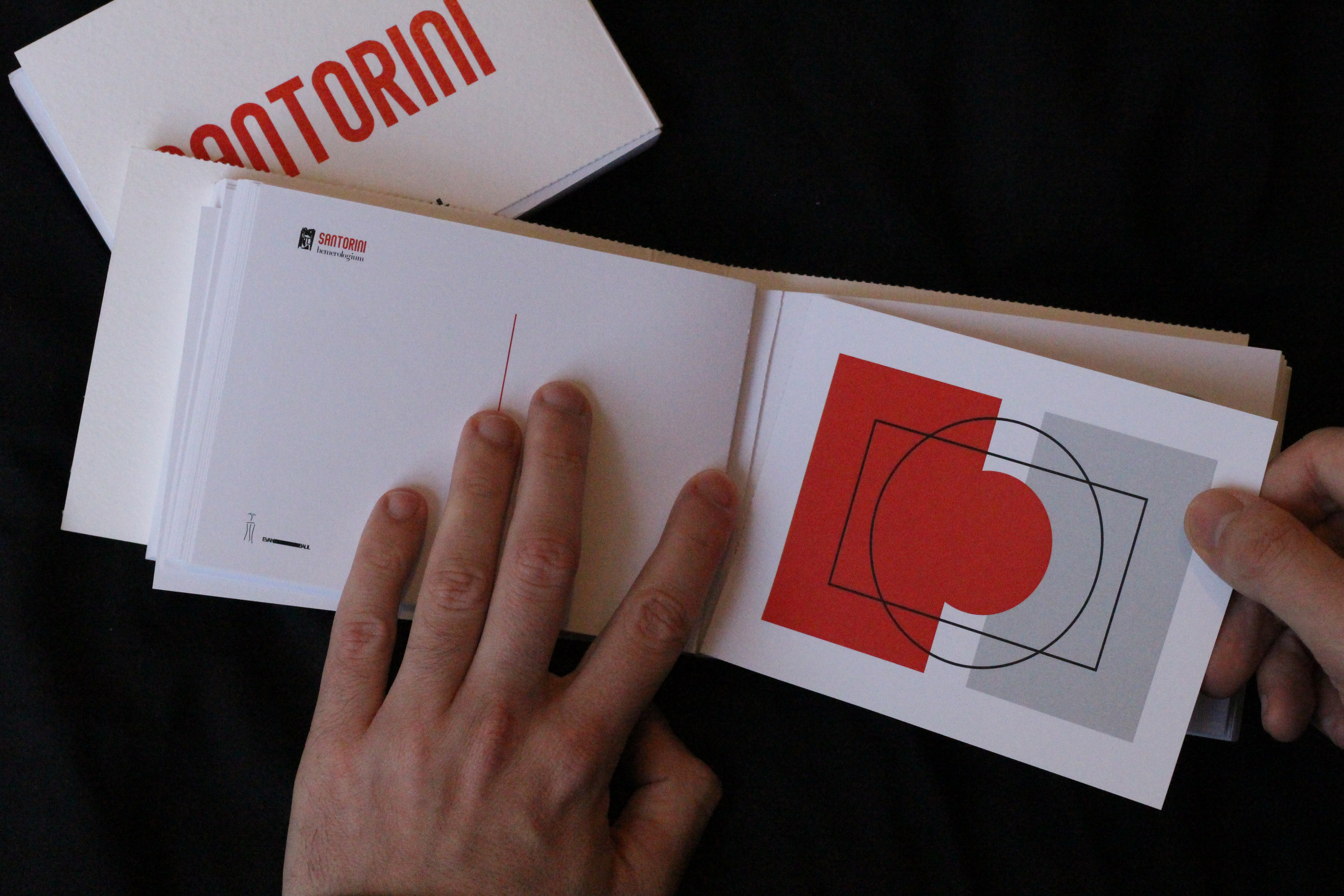
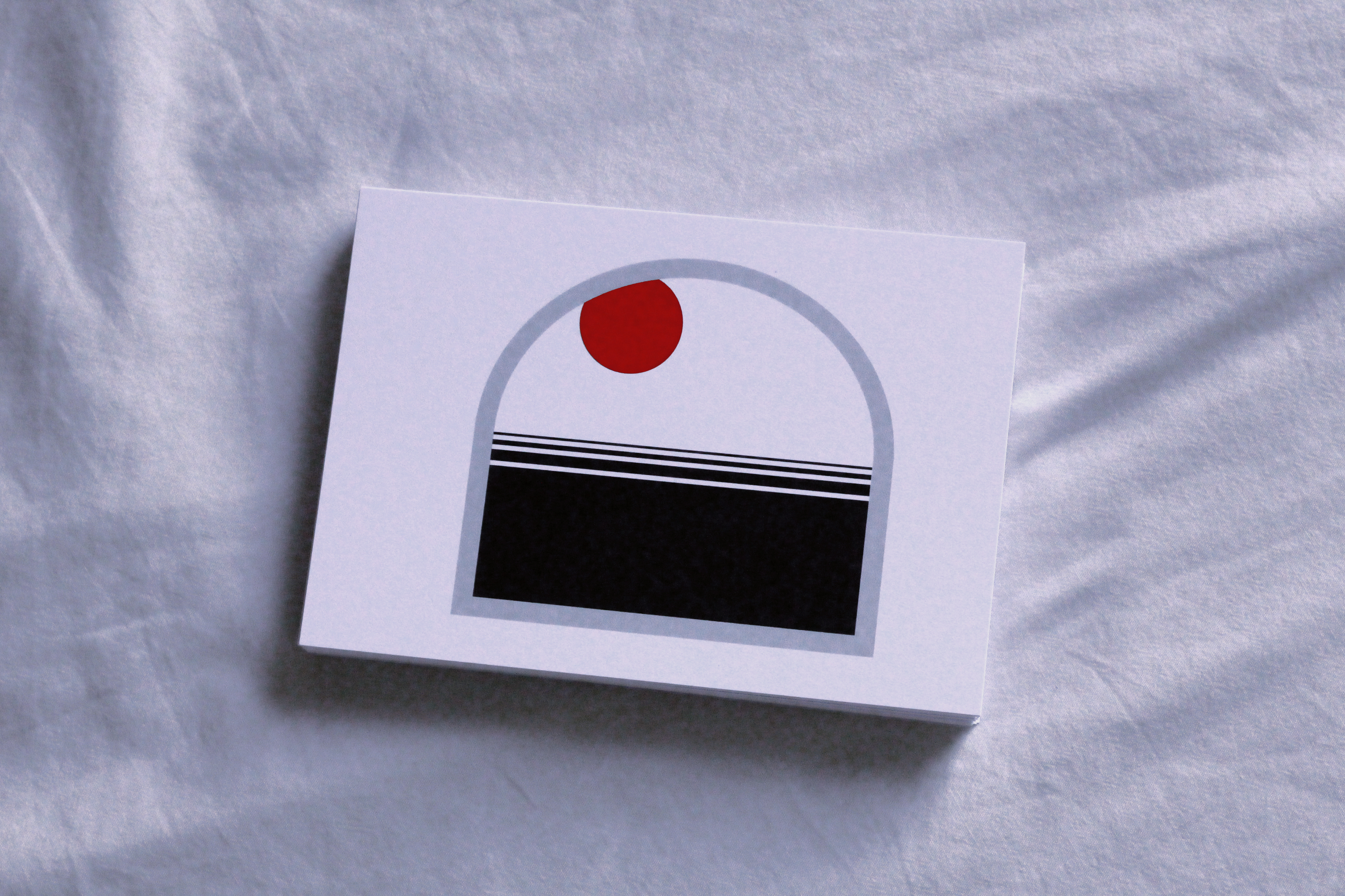
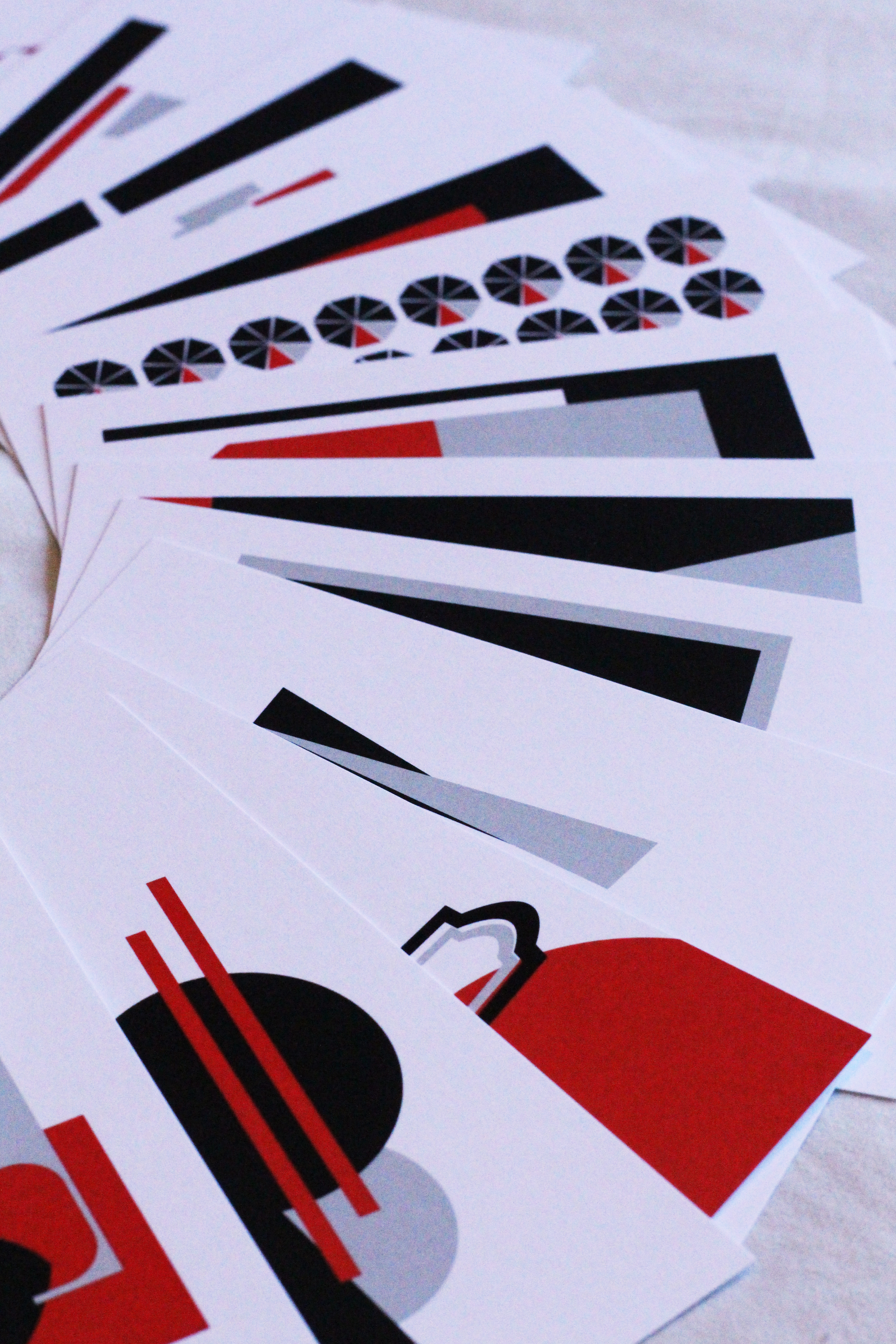
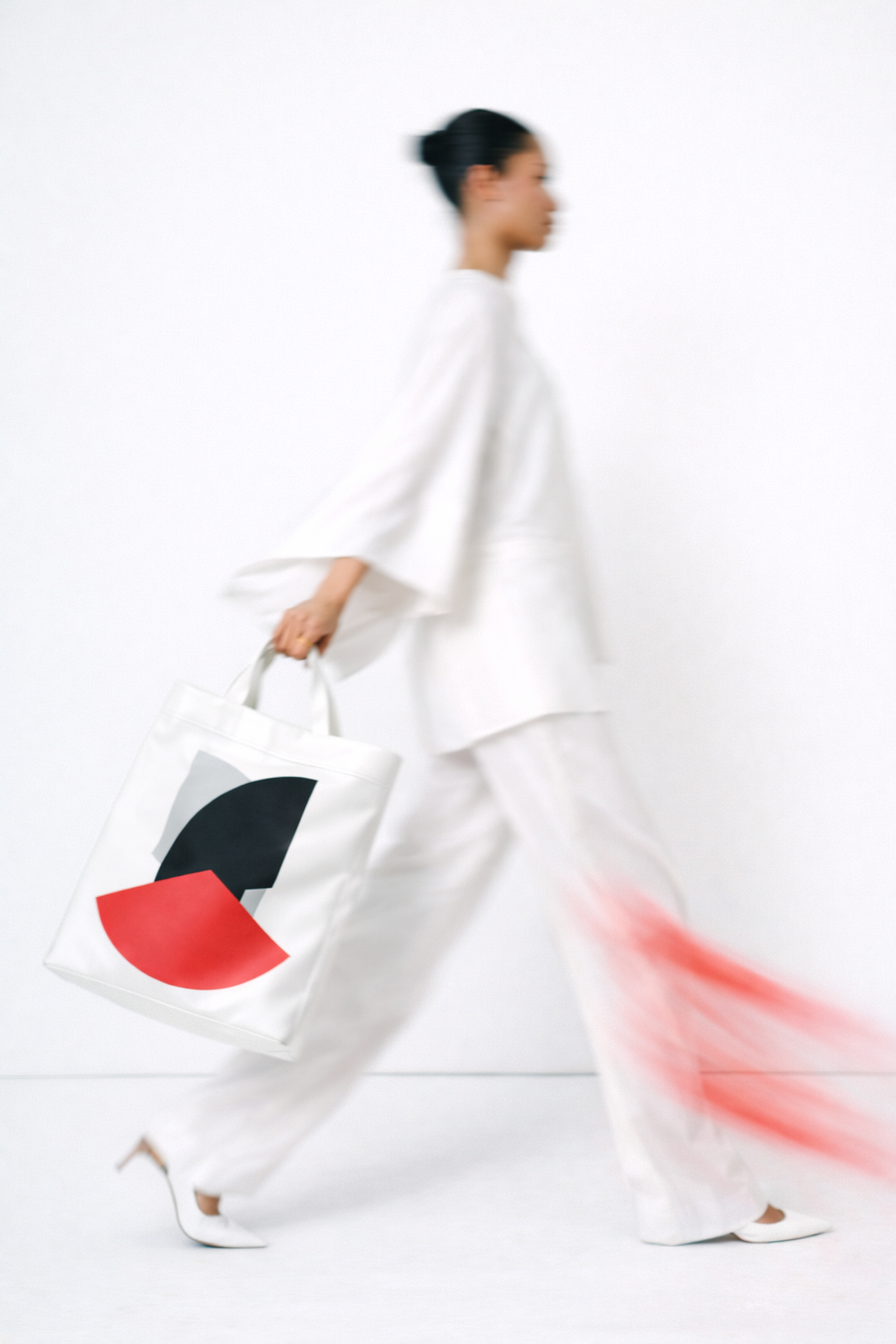
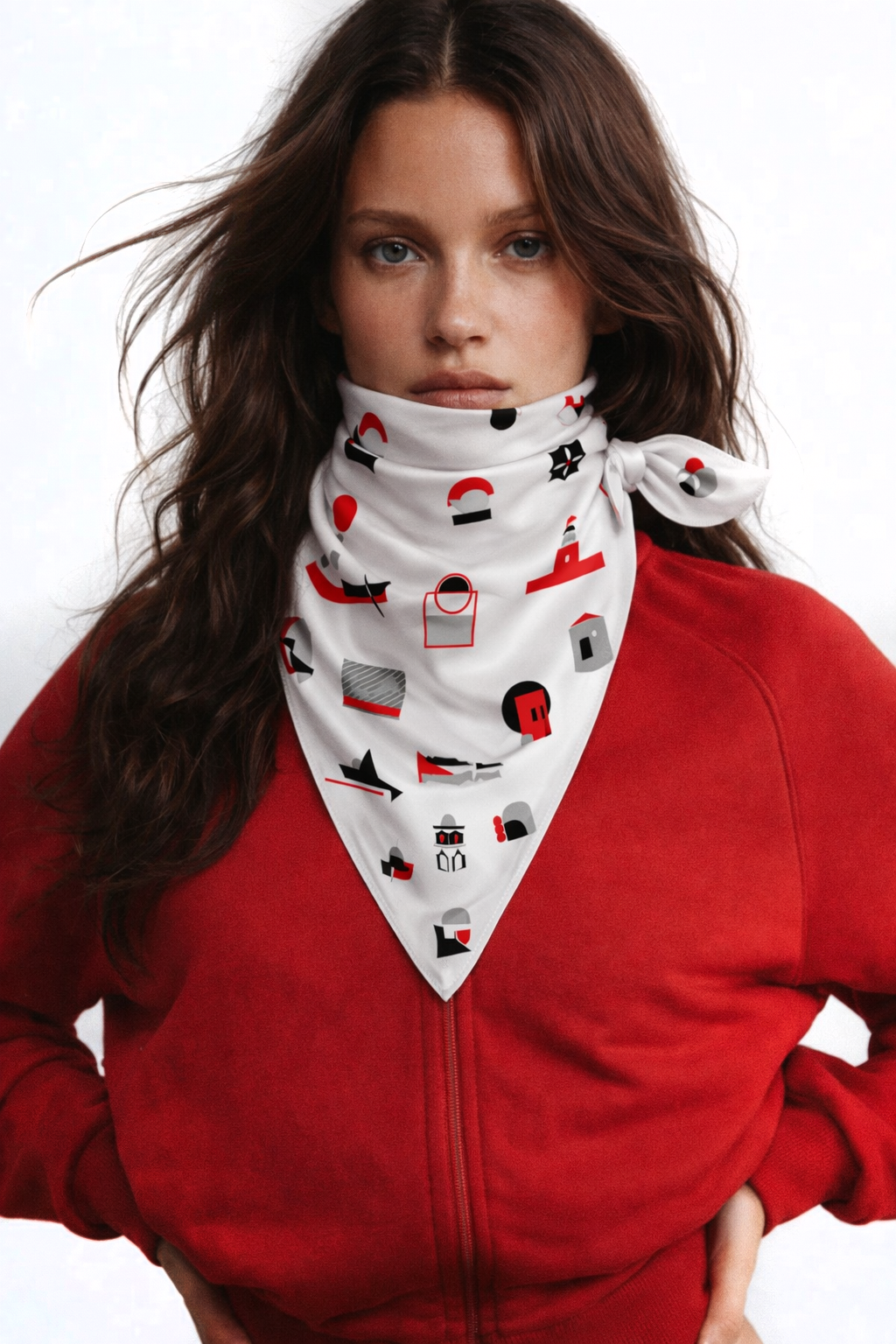
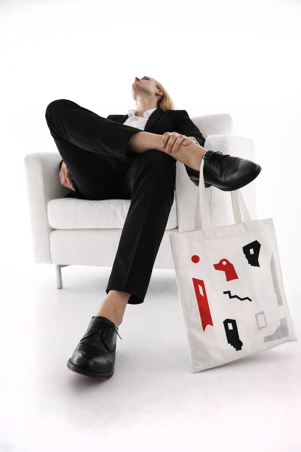
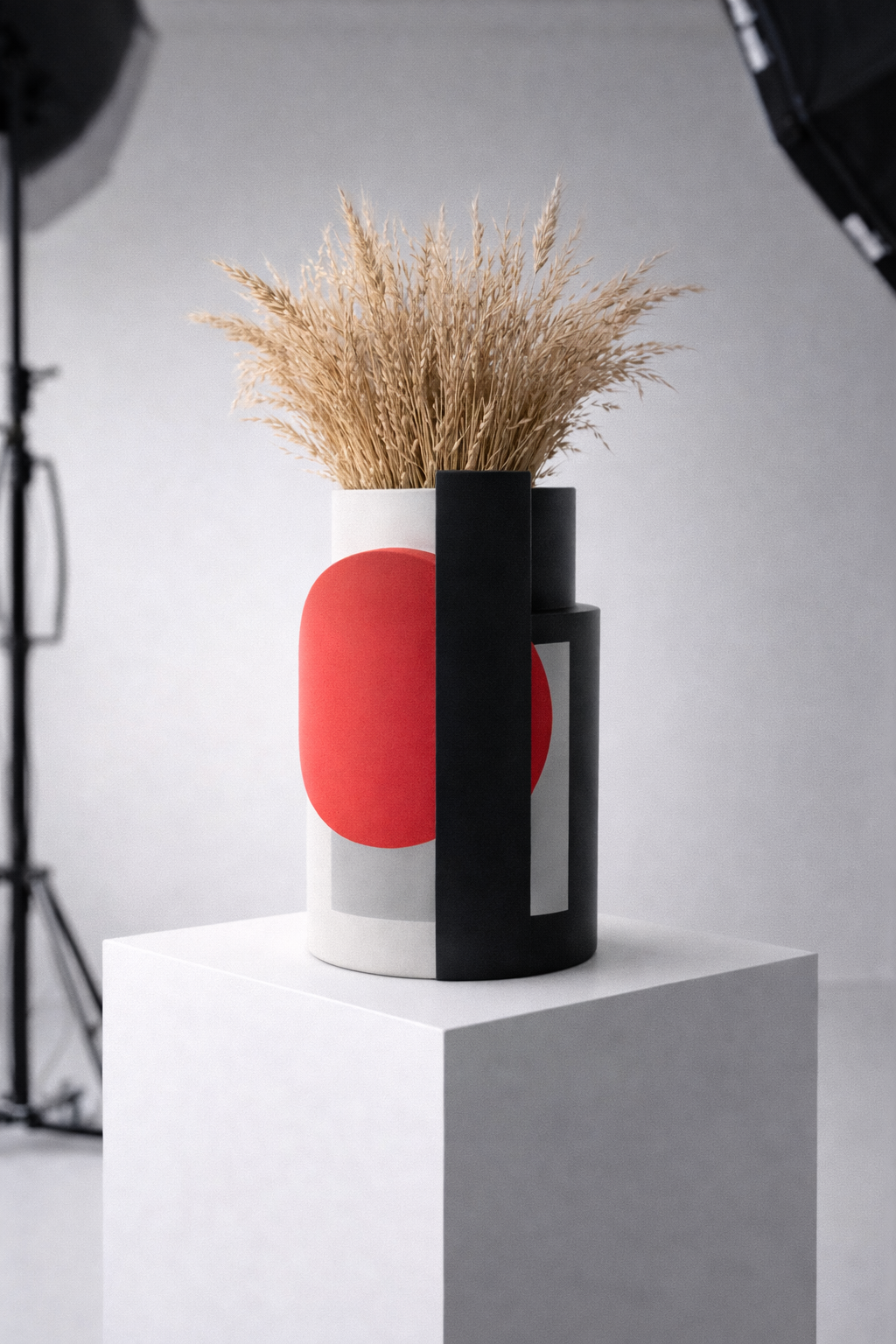
The syntheses are abstractly constructed using red and black, referencing the majestic sunset and the volcanic beaches; neutralising the composition while keeping it elegant with a sense of calmness, grey tones are added, suggesting the presence of the prominent shadowing game, which is a distinctive element of the island’s vibe.

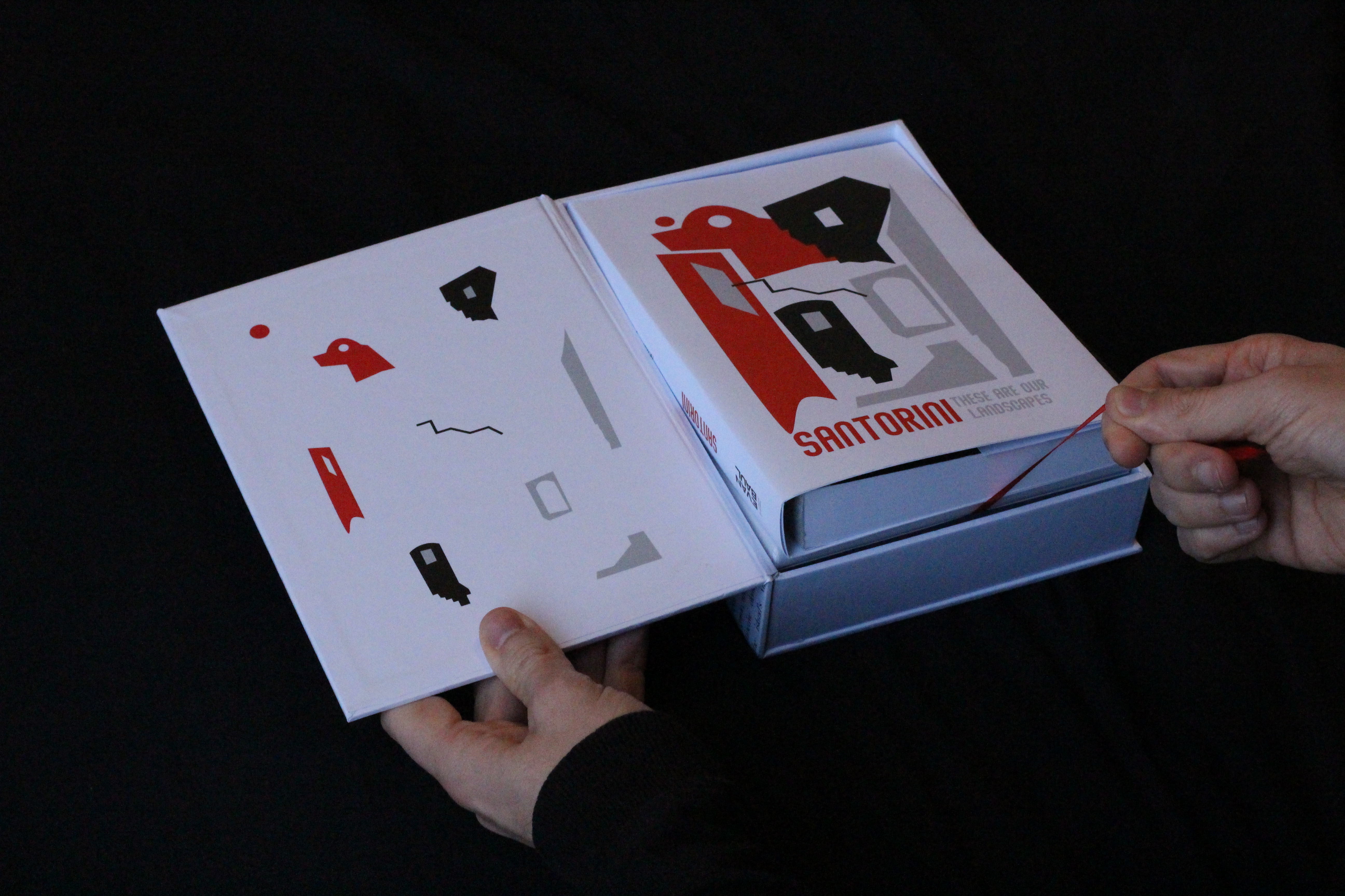
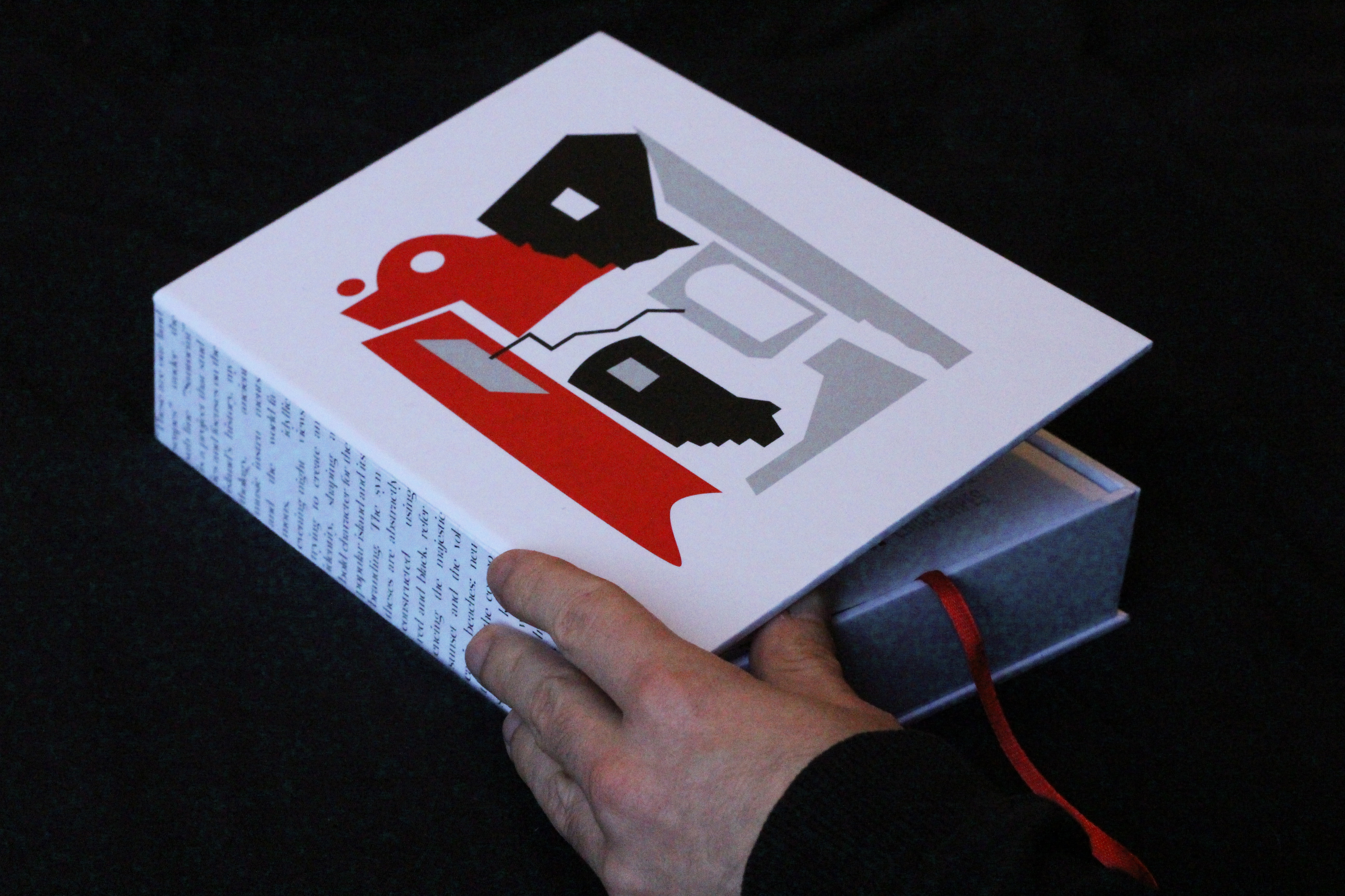
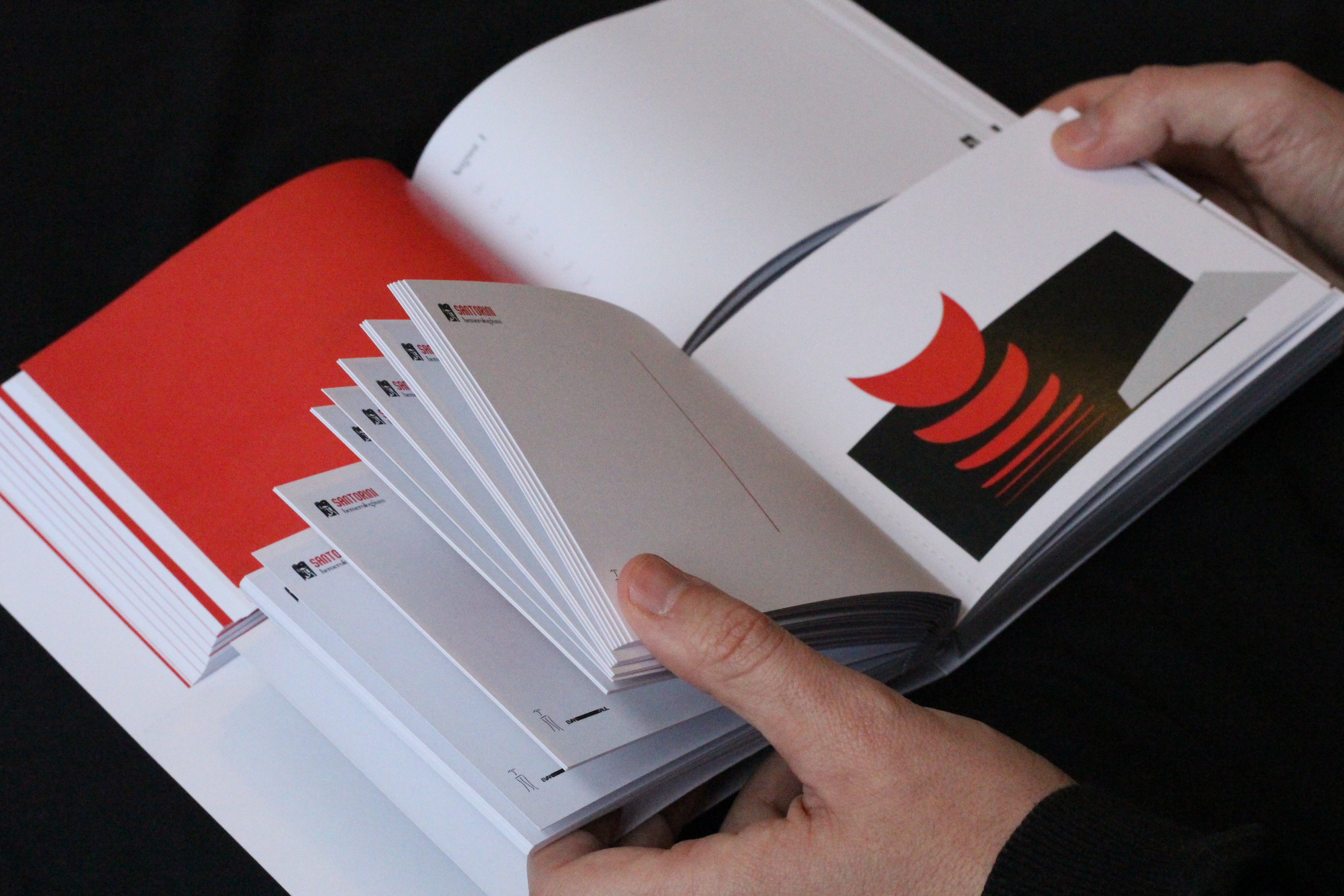
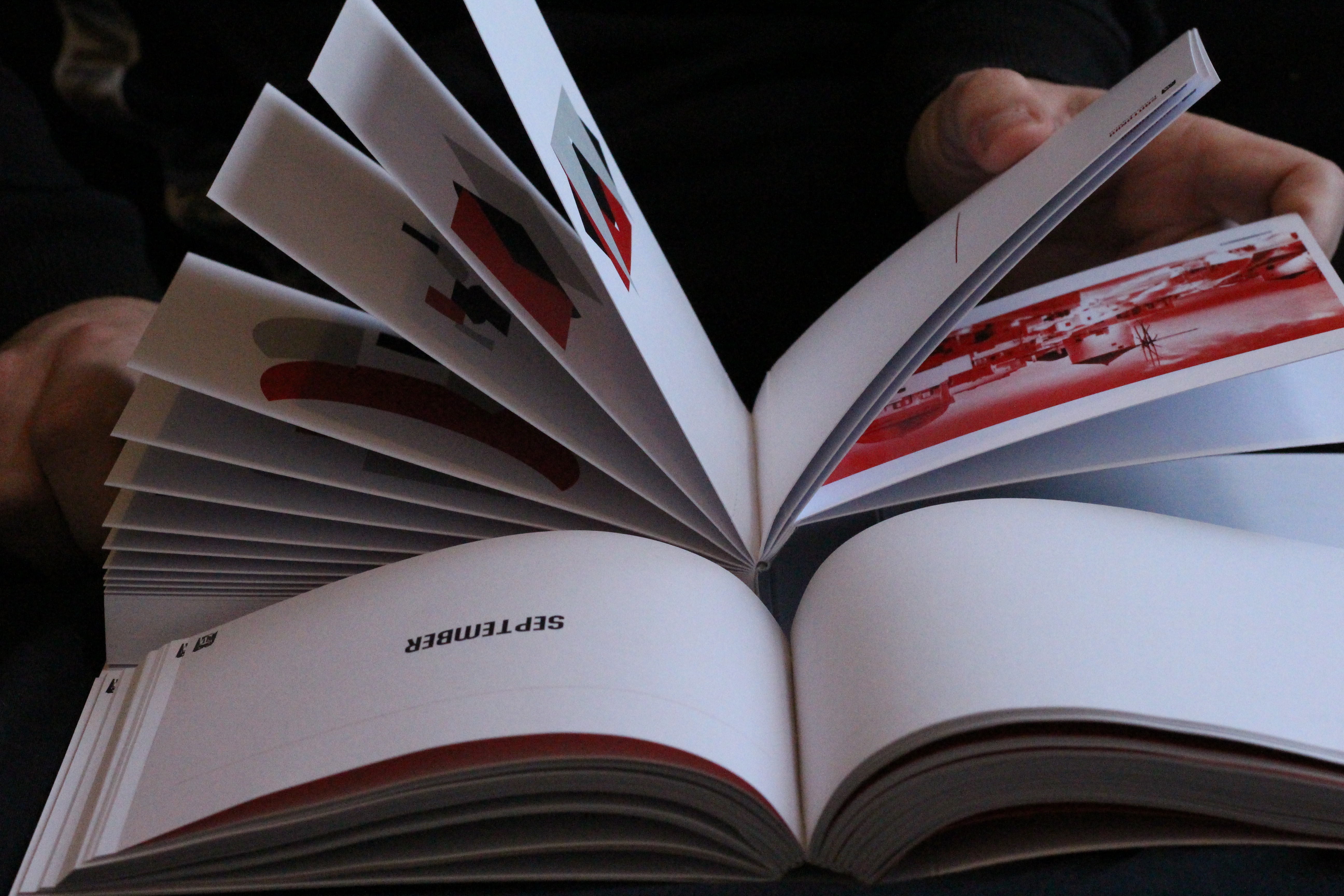
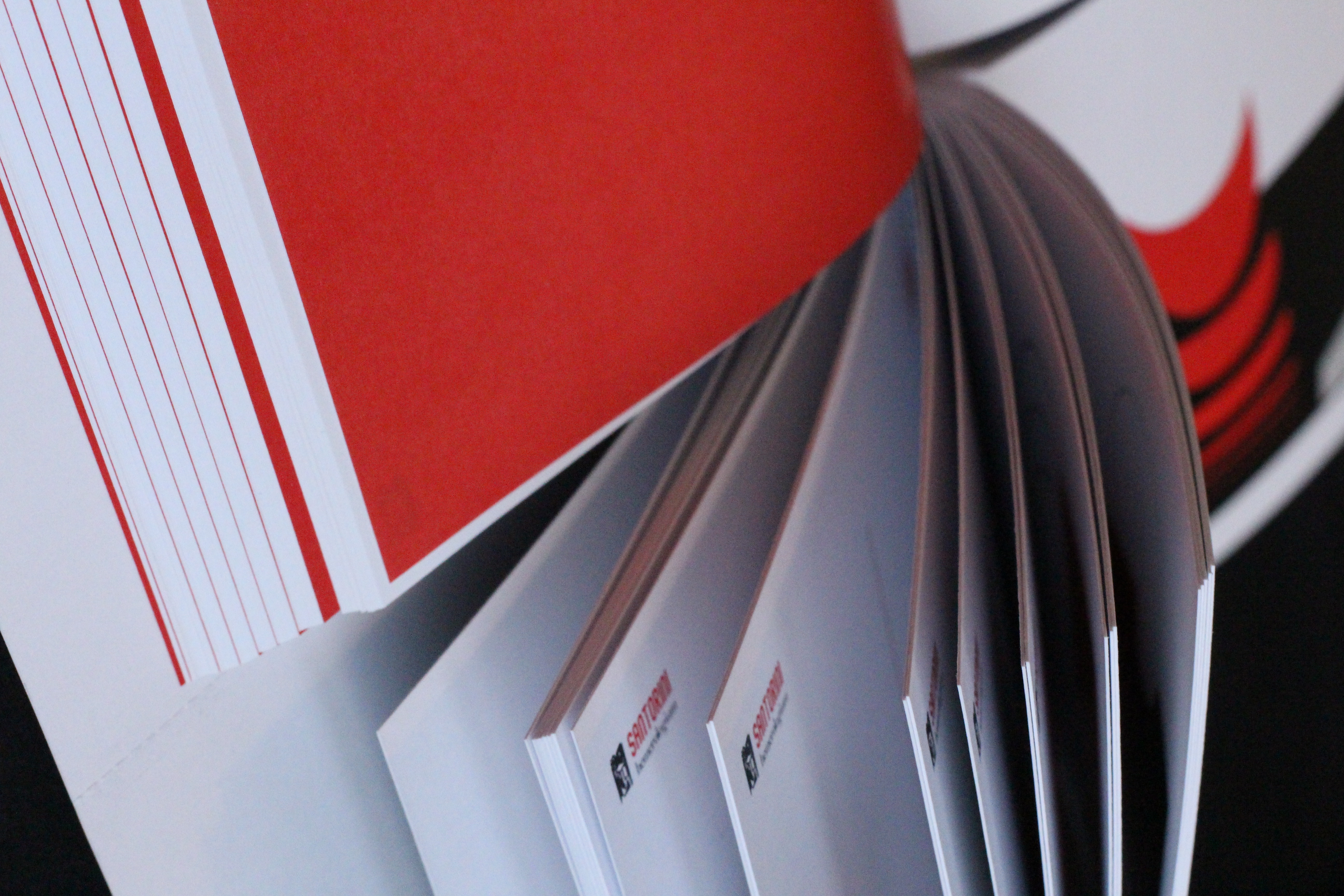
Wanting to showcase the side of the picturesque and traditional aspects of Santorini without using the classic yet obvious blue and white colours, this ‘hemerologium’ (calendar) is a daily planner that can be split into two, with the bottom half becoming a series of carte-postals.

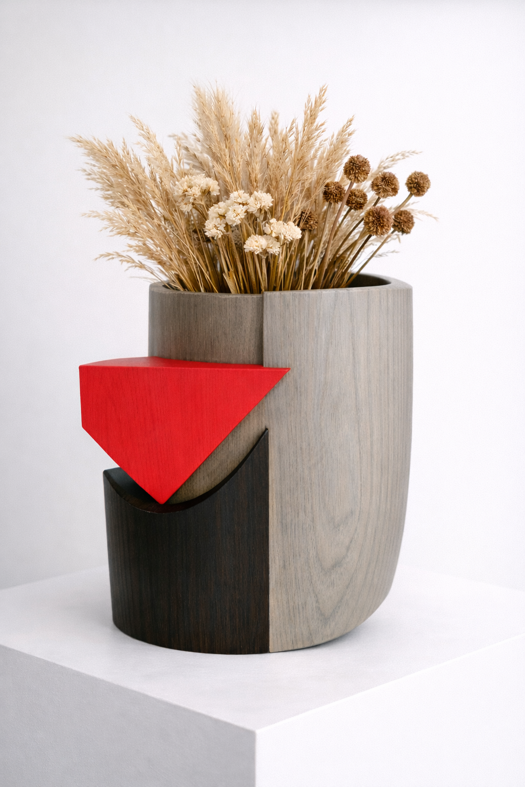
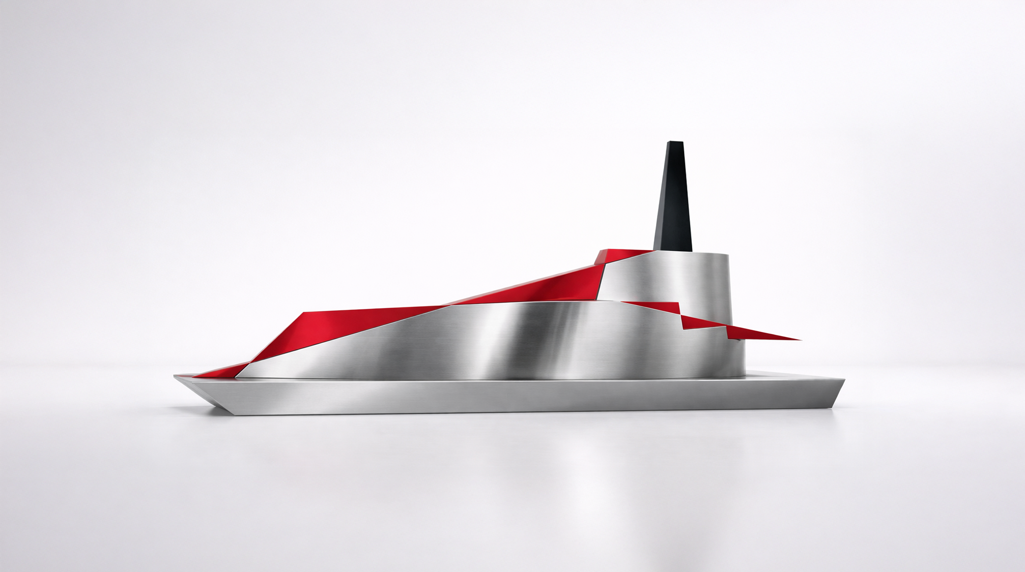
As part of an ongoing effort to translate these graphic compositions into physical form, early experiments have taken shape across wearables, vases, and paperweights. Each iteration explores how flat, abstract language can become tactile and dimensional, with the process continuing to evolve as new objects and applications emerge.


©LE PAUVRE MOUTARD
Born on the same day, but a few years apart from the American gangster Meyer Lansky, Evan Baul (like bawl) is a double fraud and a multidisciplinary designer.