Velonina
2026Filed under:
Creative Direction,
UI, Storytelling,
Branding
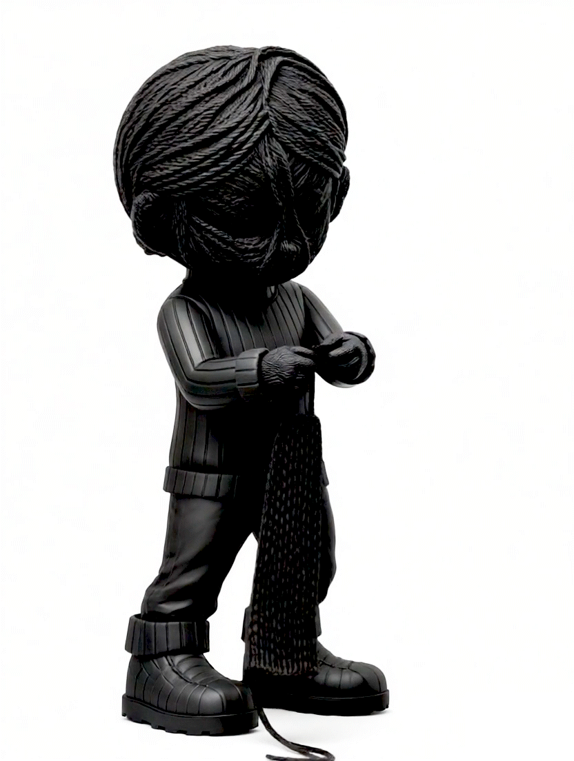
In the remote mountains of a small island, there once existed an old tradition. People said that when the earth wished to bring joy to humans, it would weave a being from its very own core.
And so Velonina was born, a magical girl made entirely of thread, with hair that never stopped producing yarn filled with colour and light.
Velonina is coming soon
And so Velonina was born, a magical girl made entirely of thread, with hair that never stopped producing yarn filled with colour and light.
Velonina is coming soon
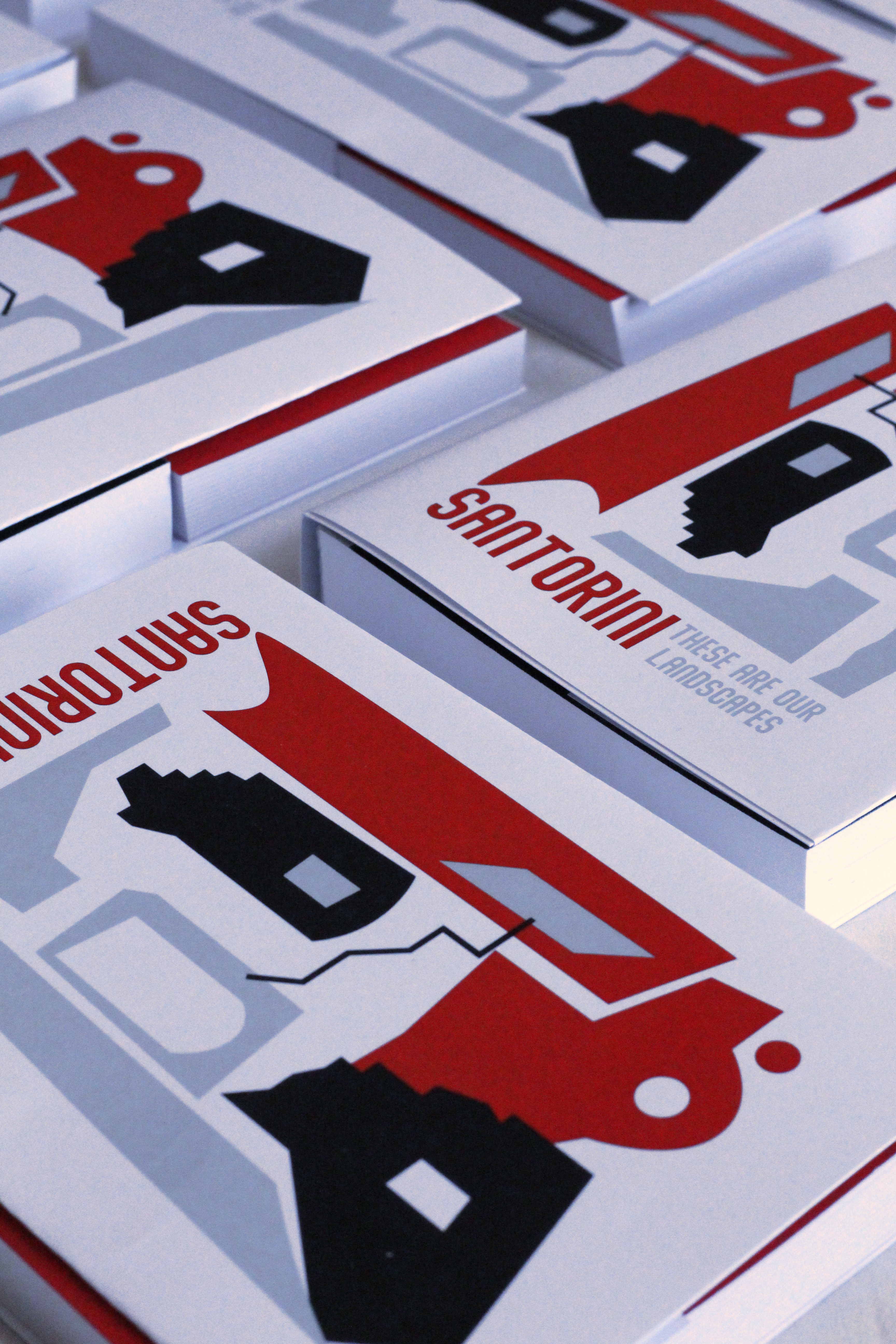
“These are our landscapes” under the sub-line “Santorini” is a project that studies and focuses on the island’s history, mythology, ancient music instruments and the world-famous, idyllic evening/night views, trying to create an identity out of the ordinary, shaping a bold character on other than the expected blue and white for the popular island and its branding.
The syntheses are abstractly constructed using red and black, referencing the majestic sunset and the volcanic beaches; neutralising the composition while keeping it elegant with a sense of calmness, grey tones are added, suggesting the presence of the prominent shadowing game, which is a distinctive element of the island’s vibe.
Wanting to showcase the side of the picturesque and traditional aspects of Santorini without using the classic yet obvious blue and white colours, this ‘hemerologium’ (calendar) is a daily planner that can be split into two, with the bottom half becoming a series of carte-postals.
As part of an ongoing effort to translate these graphic compositions into physical form, early experiments have taken shape across wearables, vases, and paperweights. Each iteration explores how flat, abstract language can become tactile and dimensional, with the process continuing to evolve as new objects and applications emerge.
︎See more of the project here
Tamango
OngoingFiled under:
Photography,
Editing,
Fashion Blog Curation
Tamango is a street-fashion project by Gorka that has been evolving for over a decade. What began as a personal hobby slowly grew into a more elaborate visual language, shaped by curiosity, consistency, and the desire to explore what can be achieved with simple means. Across the years, it has become a living archive of outfits and atmospheres, capturing both daring combinations and everyday looks, often with a subtle twist that turns the familiar into something unexpected.
The blog blends high-street, vintage, and found pieces, treating clothing as material in constant conversation with its surroundings. Cities, buildings, sidewalks, coastlines, and open landscapes are not just backdrops but active elements, adding texture, rhythm, and mood to each look. A cracked wall might echo a worn denim seam; a quiet street might soften a bold silhouette. Every image becomes a small encounter between style and place.
Being both a source of inspiration and a space for visual pleasure, Tamango is there to show that fashion does not need grand productions or perfect conditions to feel alive. With patience, attention, and a playful eye, even the simplest tools can create something rich and expressive. Over time, the project has grown into a testament to how creativity compounds: one outfit, one corner of a city, one experiment at a time.
︎See more of the project here
︎ Visit Tamango here
Klementine
2025Filed under:
Creative Direction,
UI, Storytelling,
Branding
Klementine is a brand identity for a boho-chic summer house in Kefalonia, Greece, conceived as a living character rather than a place. Named after the citrus trees in its garden, Klementine embodies warmth, hospitality, and the slow rhythm of island life.
Klementine isn’t just a house, she’s a hostess, a feeling, a memory. Nestled in the sun-drenched hills of Kefalonia, she welcomes guests with the warmth of a Mediterranean summer, the scent of the sea in the air, and the gentle rhythm of island life.
She’s simple but thoughtful. Boho but elevated. Chic without shouting. She’s a barefoot hostess with impeccable taste, woven textures, earthy ceramics, and open doors.
The brand blends natural luxury with poetic storytelling, using soft copywriting, earthy palettes, and hand-drawn line art to evoke simplicity, sunlight, and soul. From the tone of voice to the illustrated motifs, every element is designed to feel personal and human, inviting guests not just to stay, but to step into a summer story.
︎See more of the project here
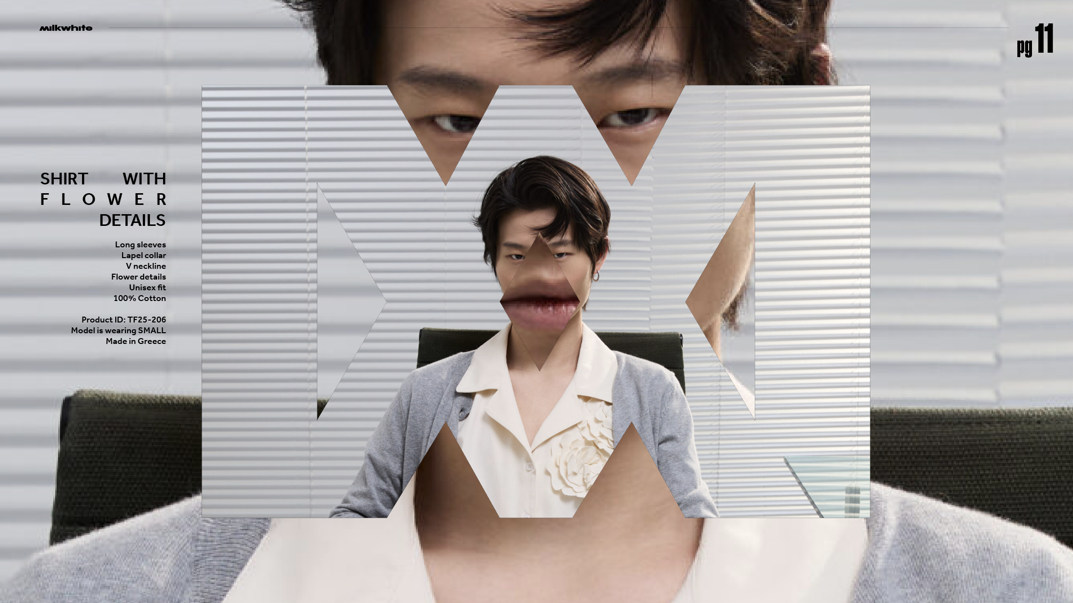
MILKWHITE
2025Filed under:
Branding,
Editorial
MILKWHITE is coming soon