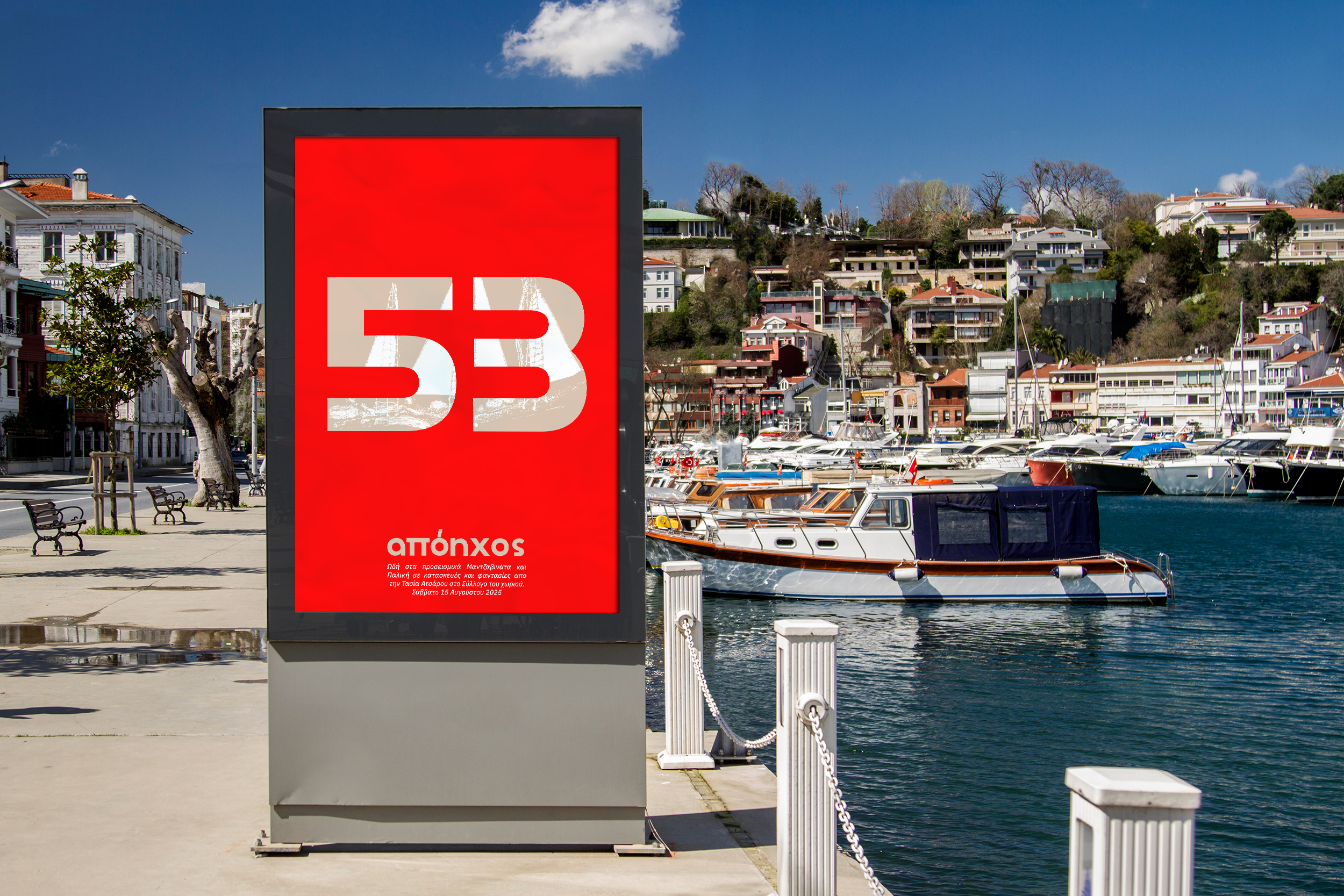
apóyhos 53
2025
2025
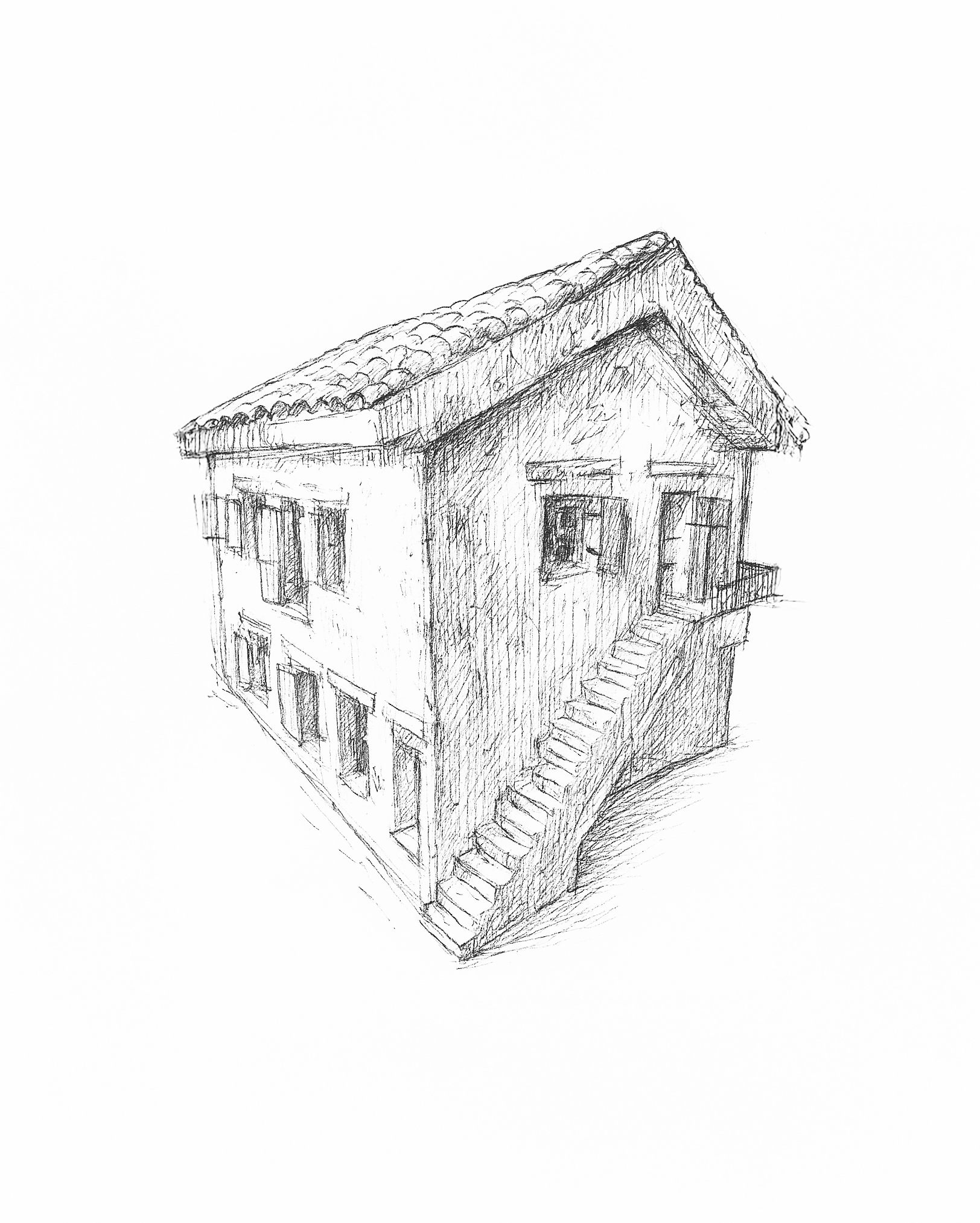
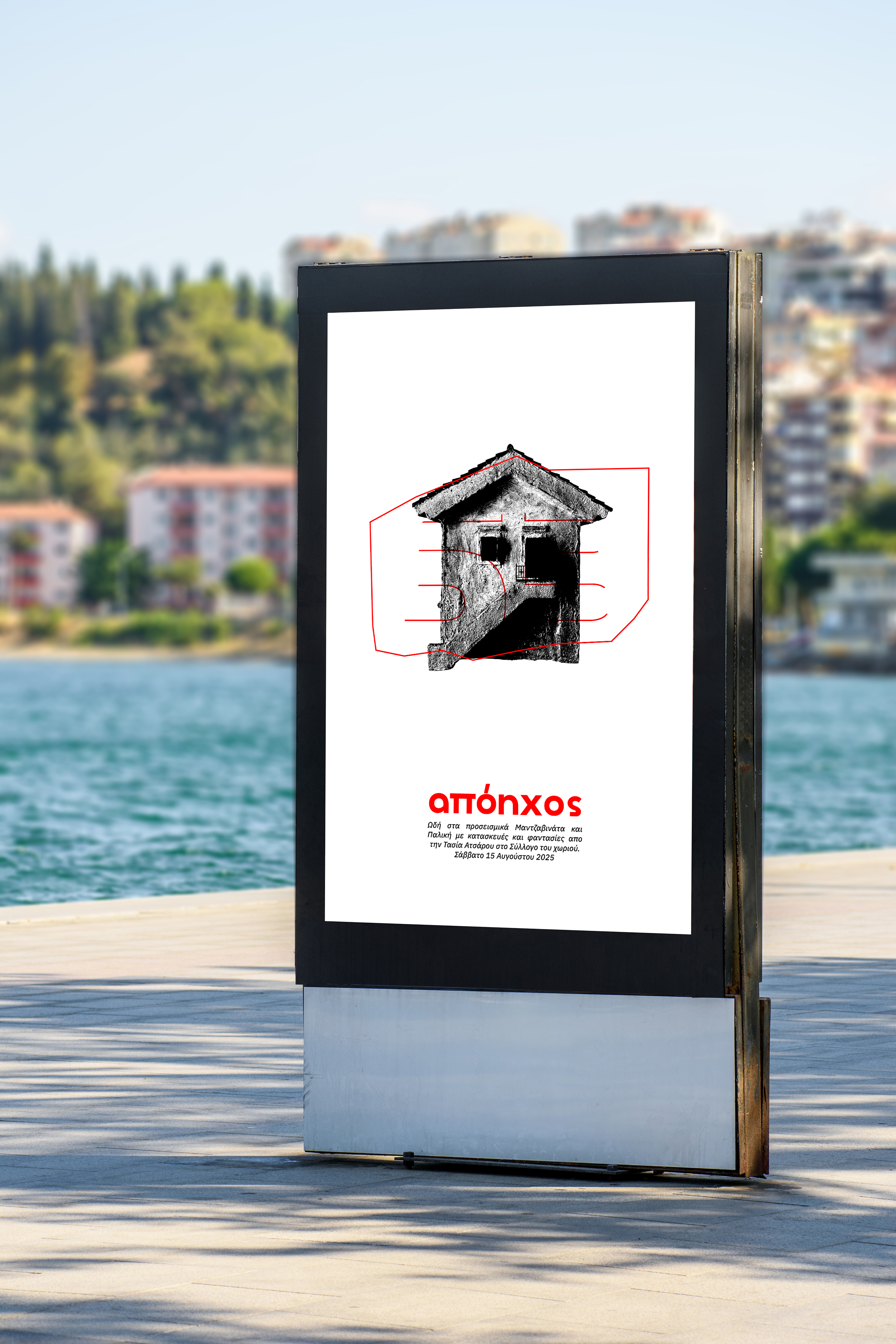
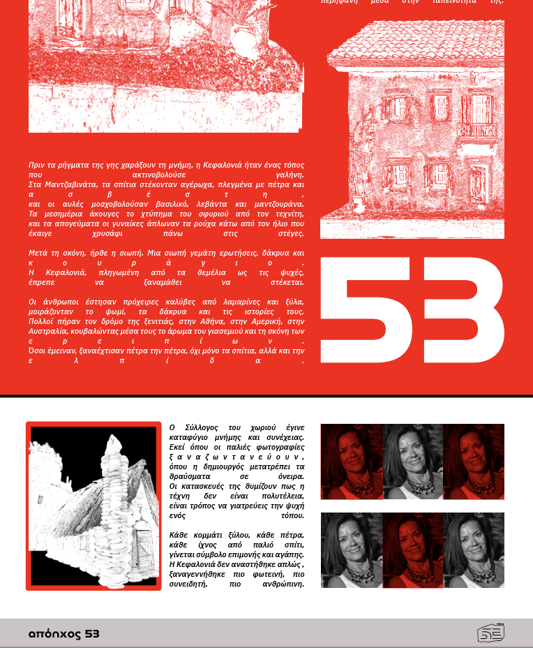
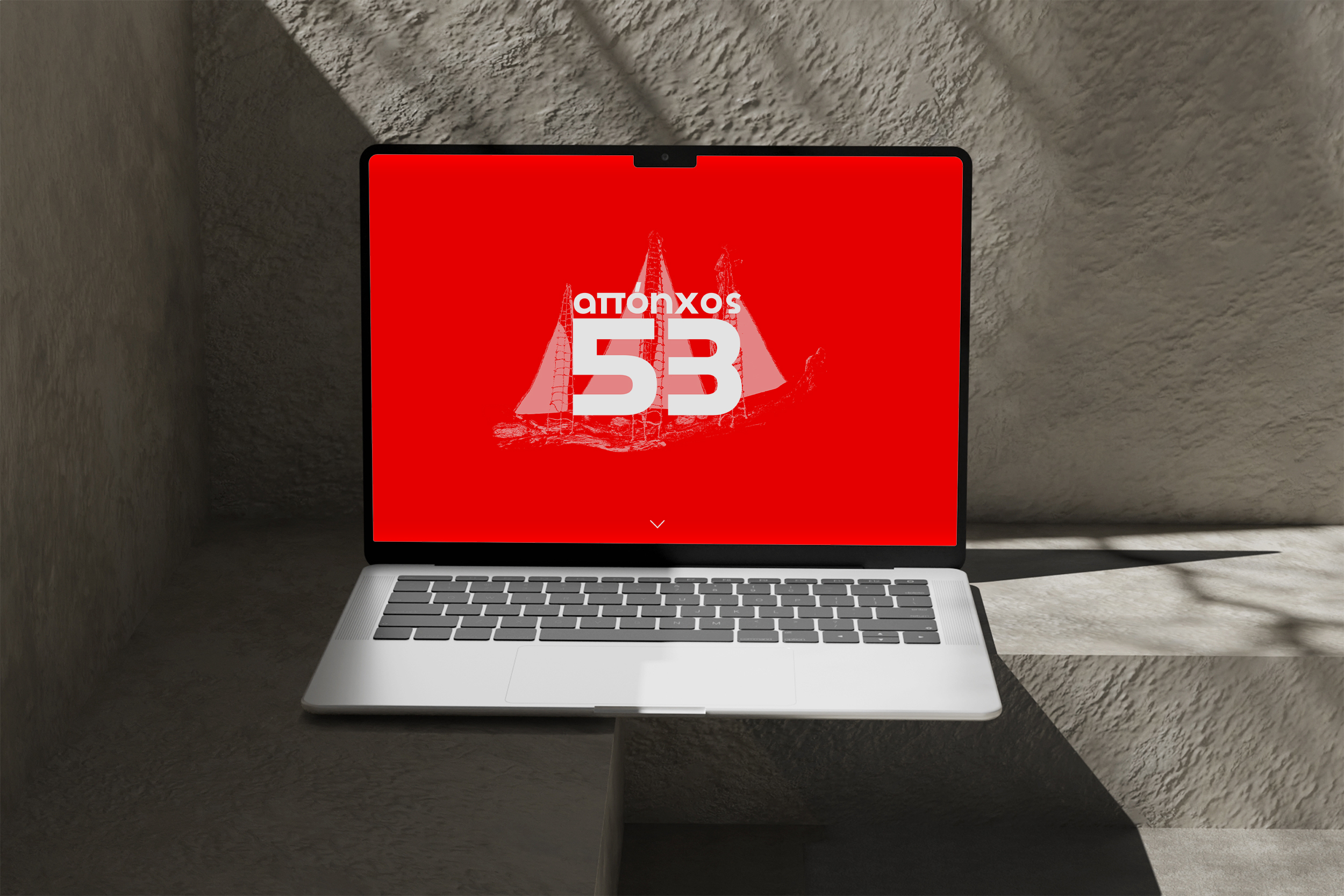
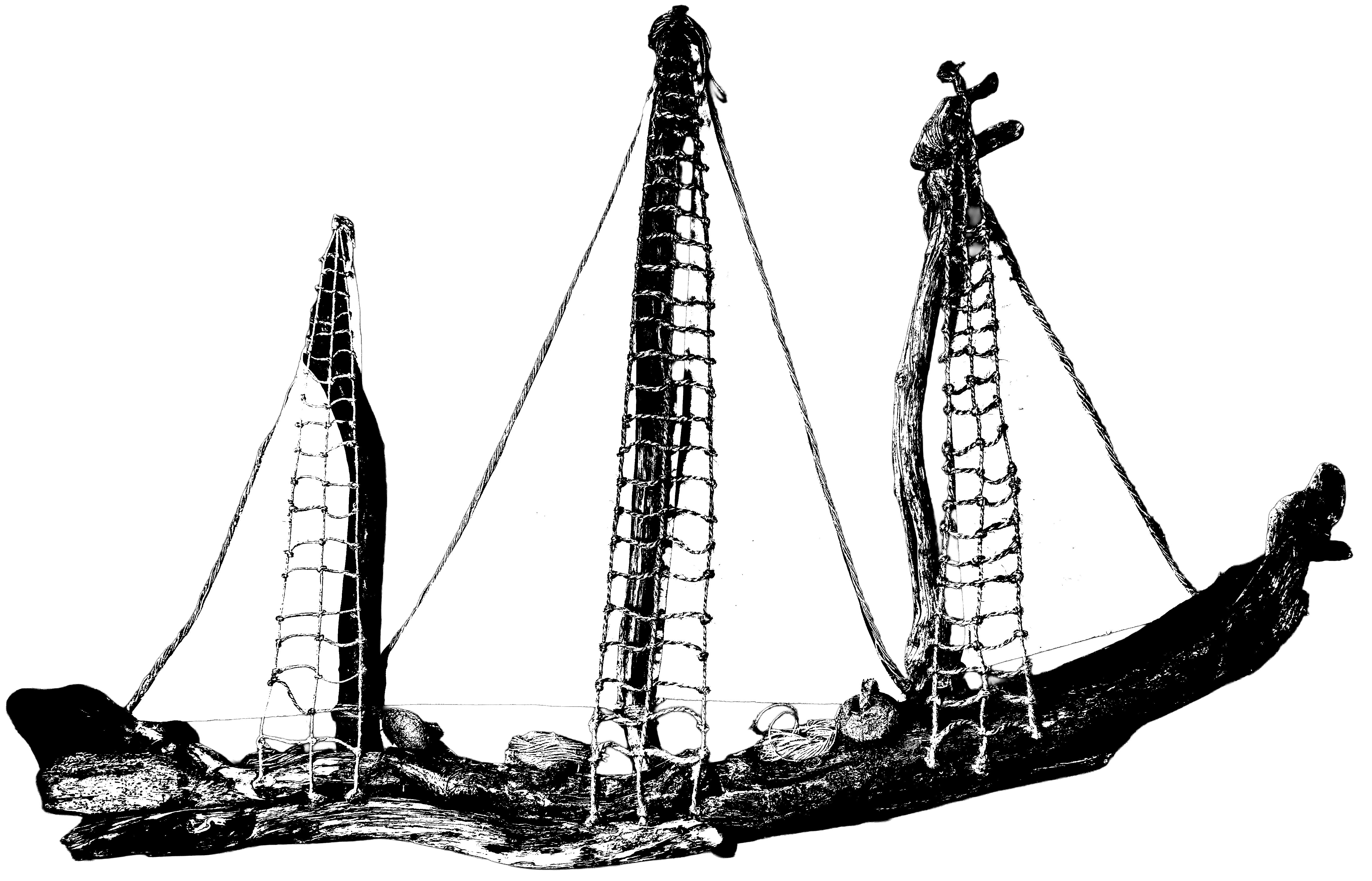
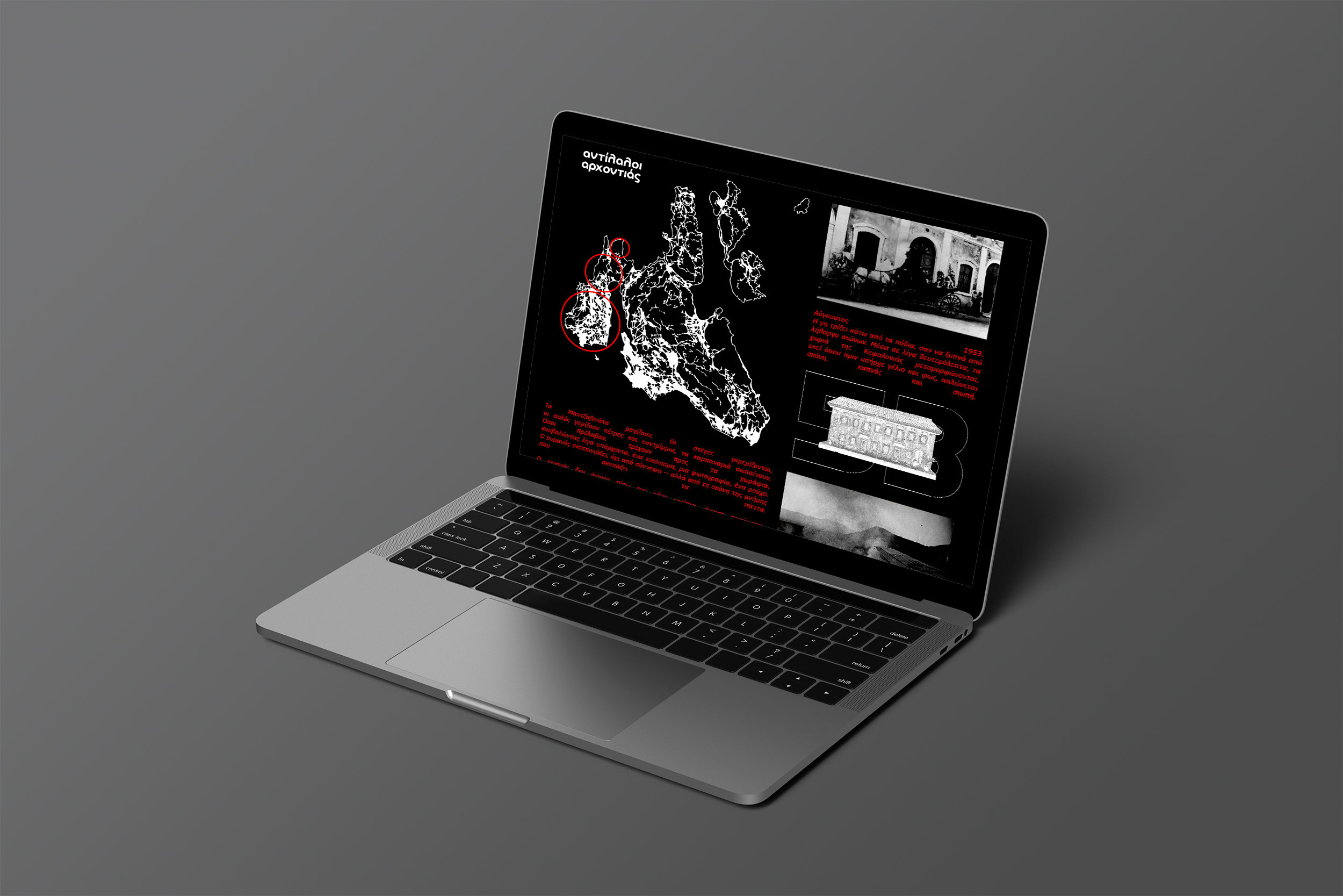
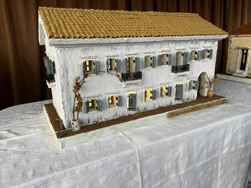
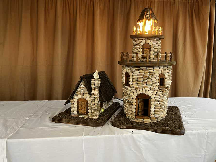
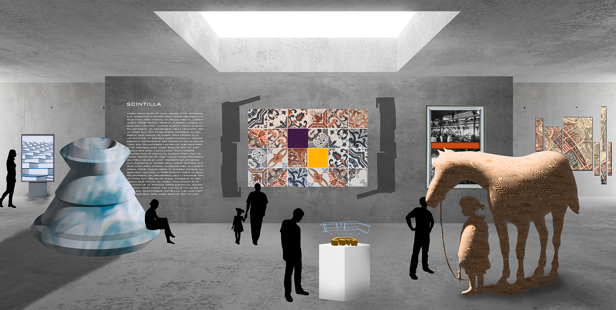
The microsite functions as a digital counterpart to the exhibition “Ode to Pre-Earthquake Mantzavinata and Paliki” by Tasia Atsarou.
It integrates historical context and artistic narrative to convey Kefalonia’s transformation after the 1953 earthquake. The visual design, informed by the exhibition posters I created, reflects the material and tonal qualities of Atsarou’s handcrafted works.
Together, the microsite and exhibition establish a cohesive visual and conceptual identity rooted in memory, place, and design.
Filed under:
Branding, Web Design, Poster Design
Branding, Web Design, Poster Design







ergon BENETTI
2024
2024
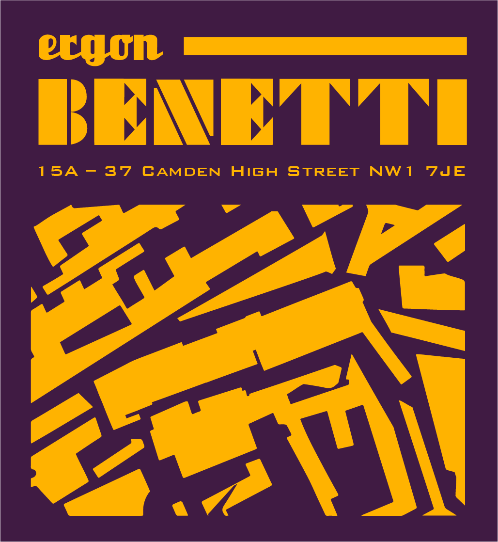
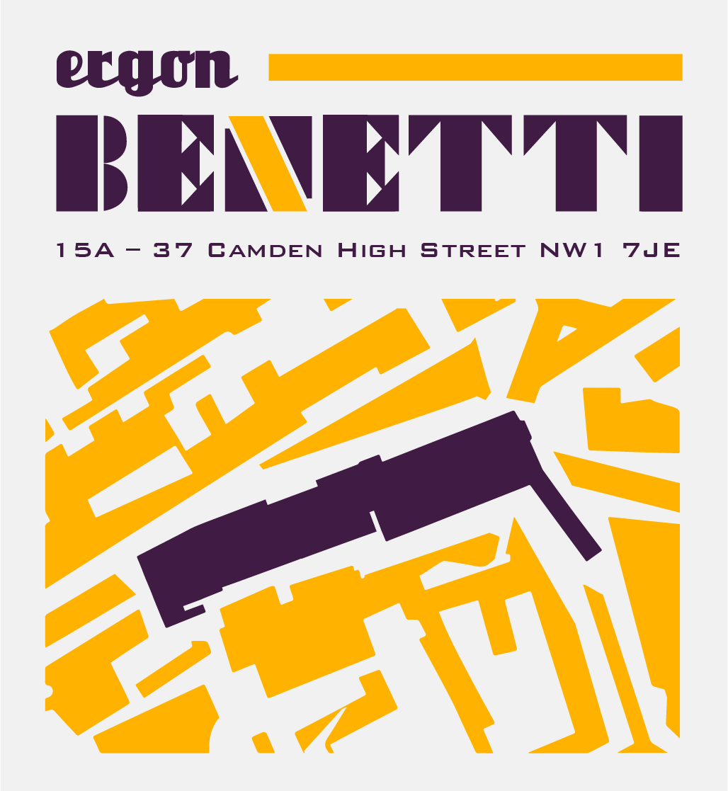
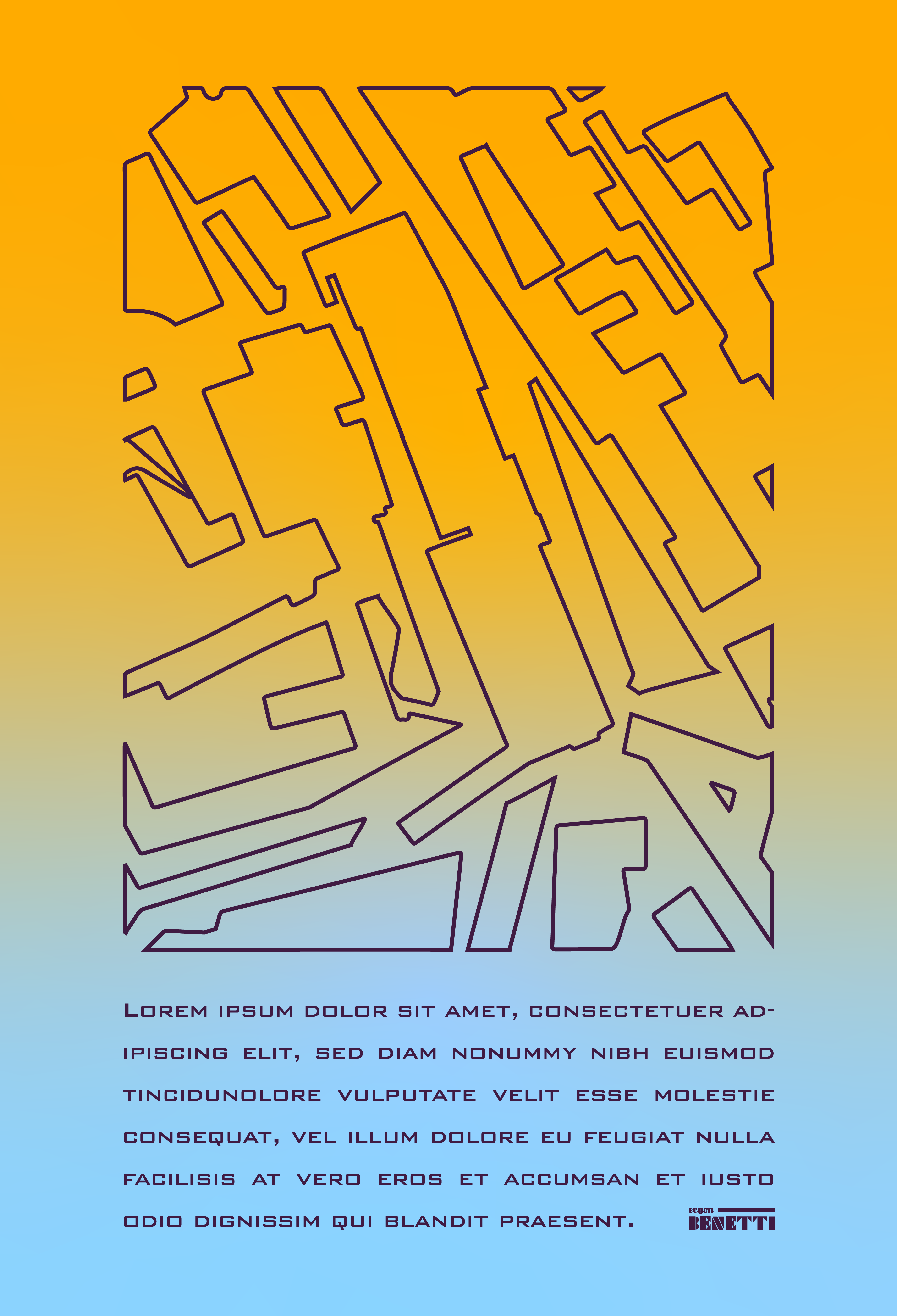
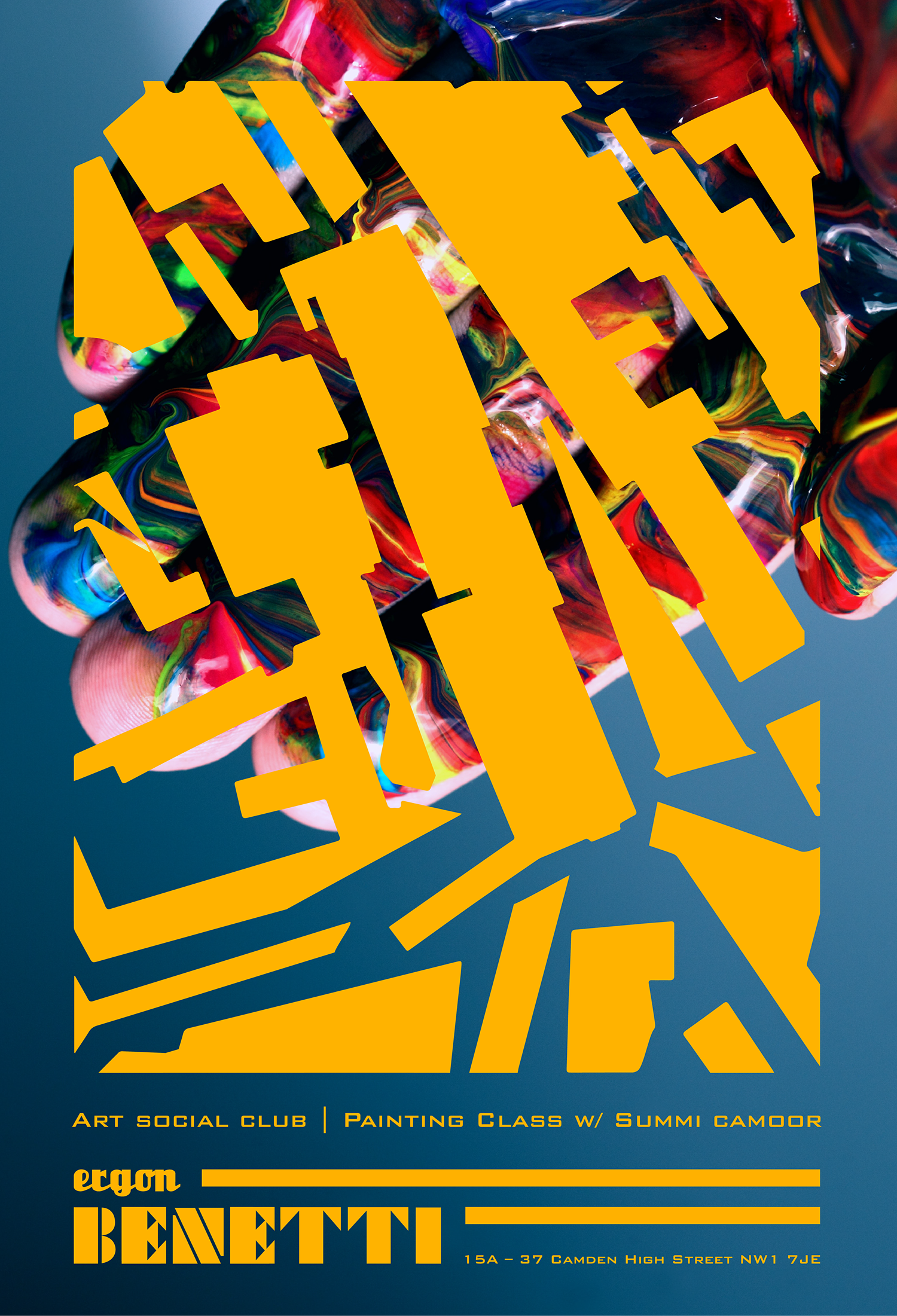
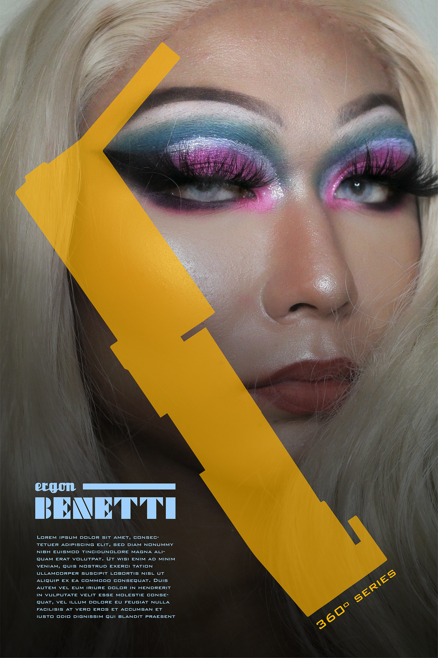
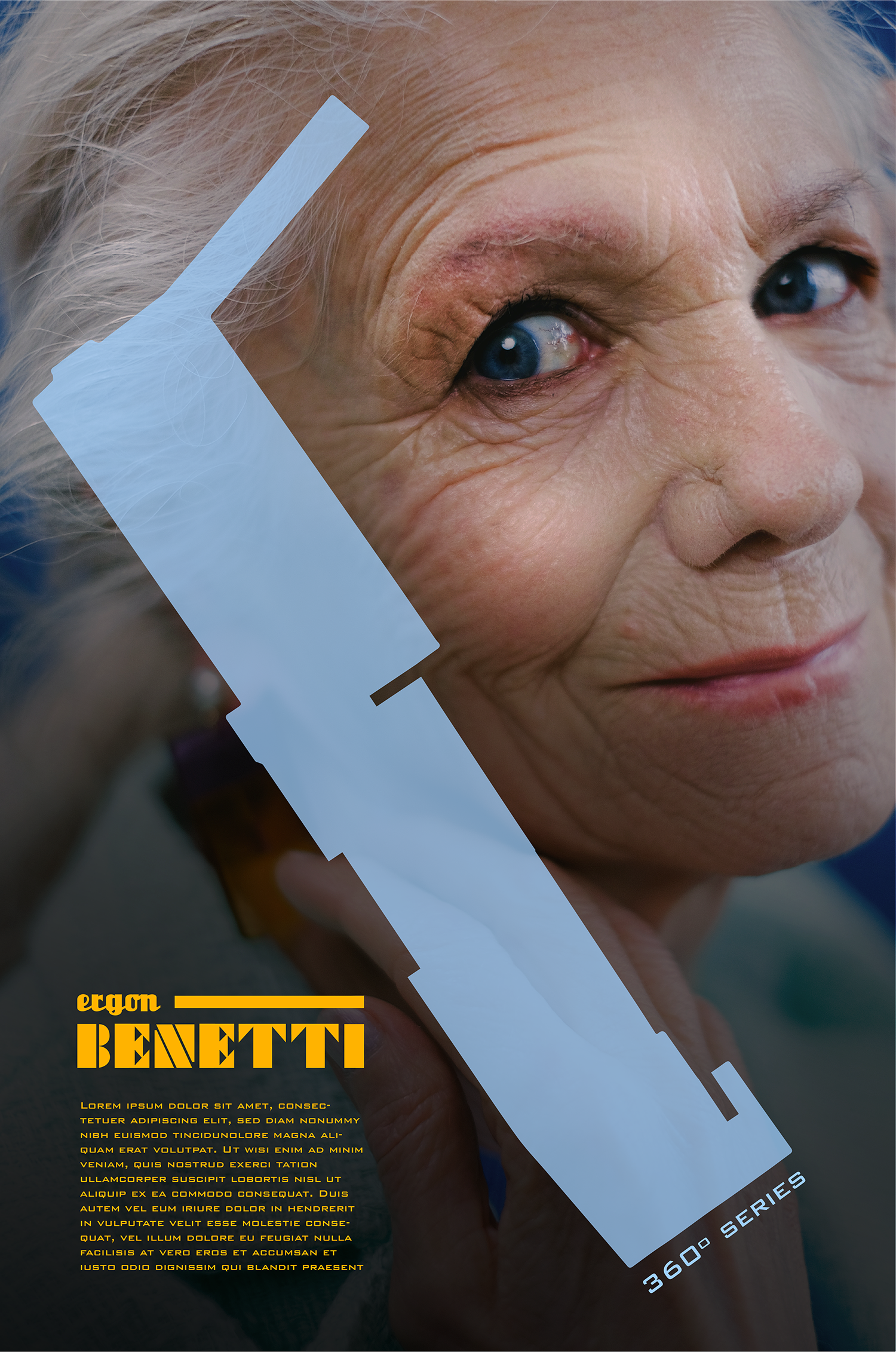
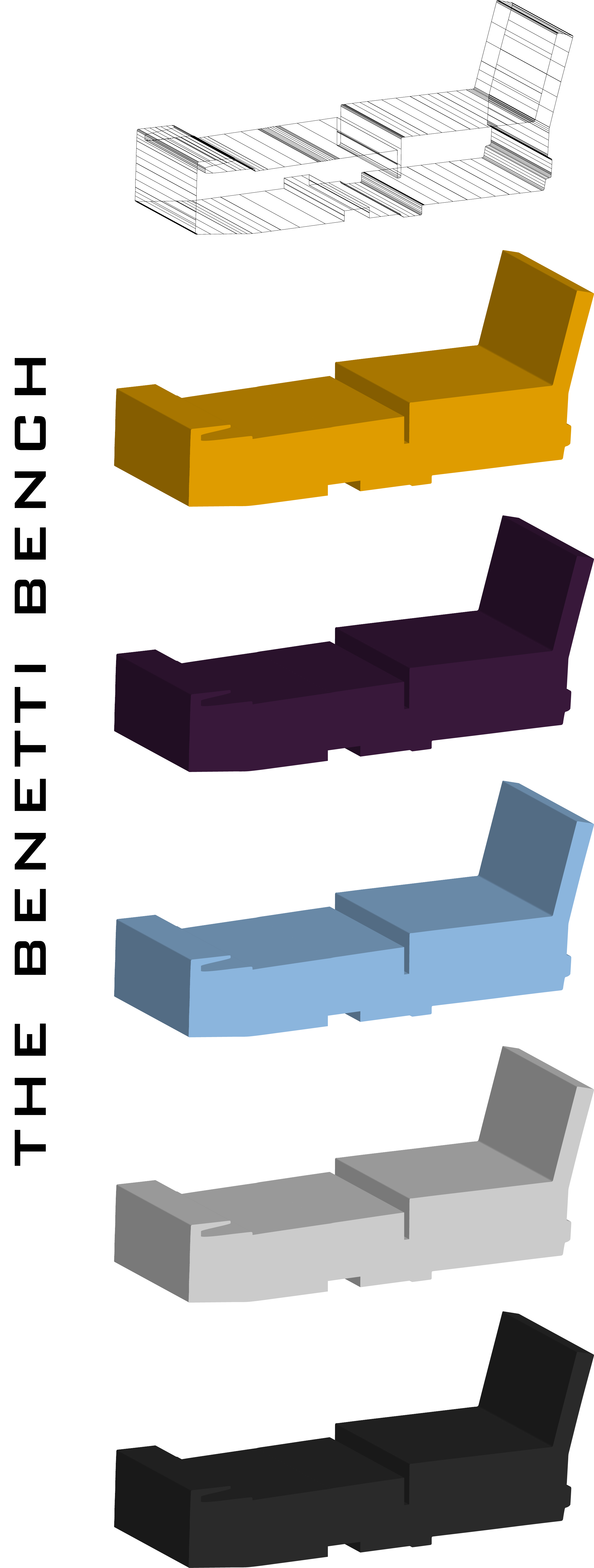
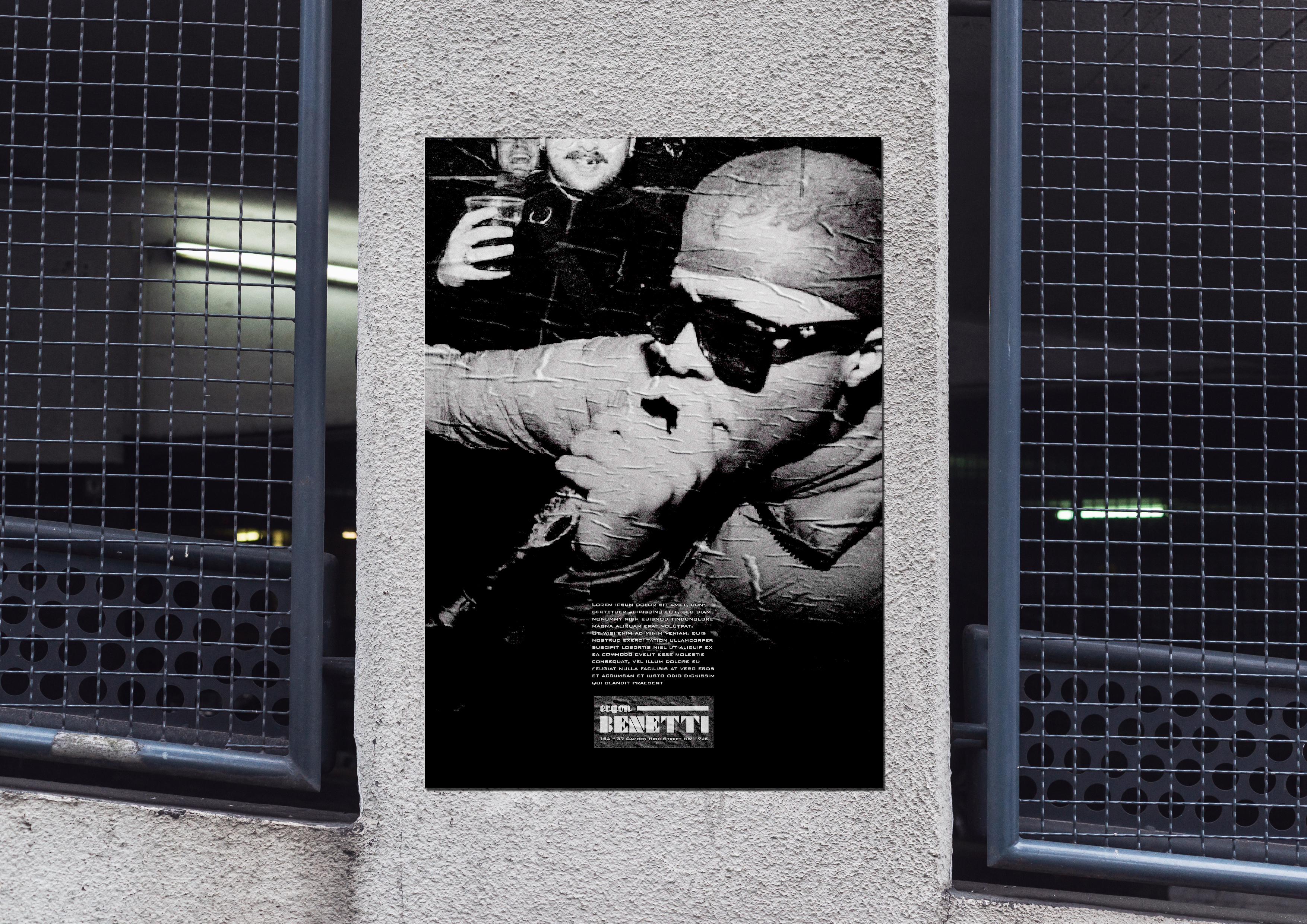
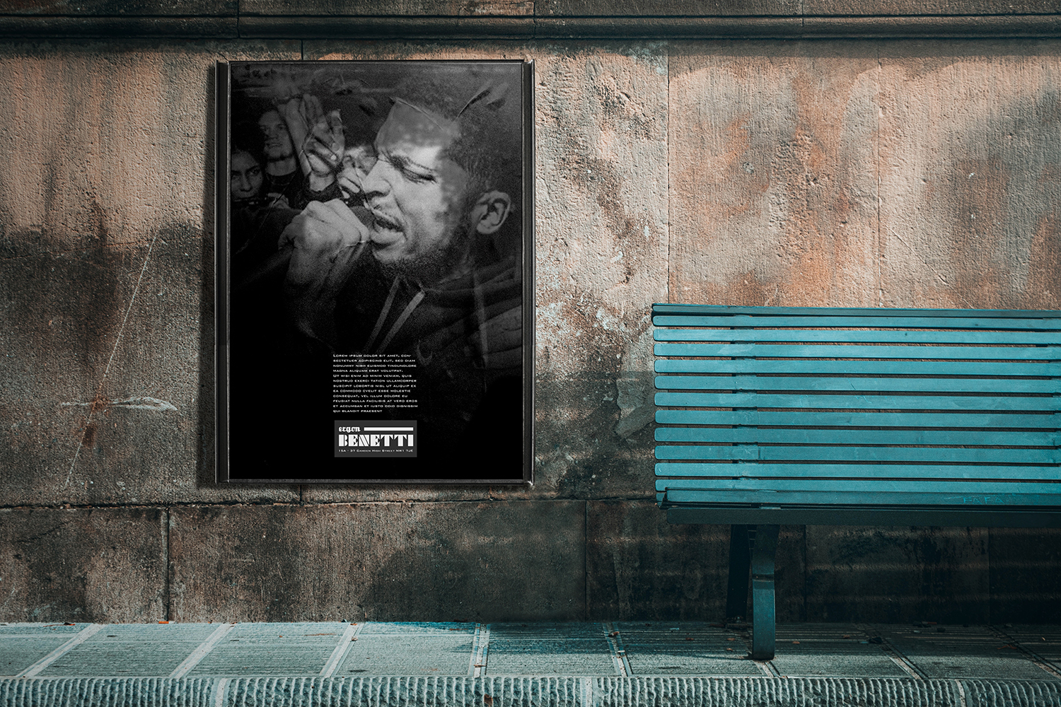
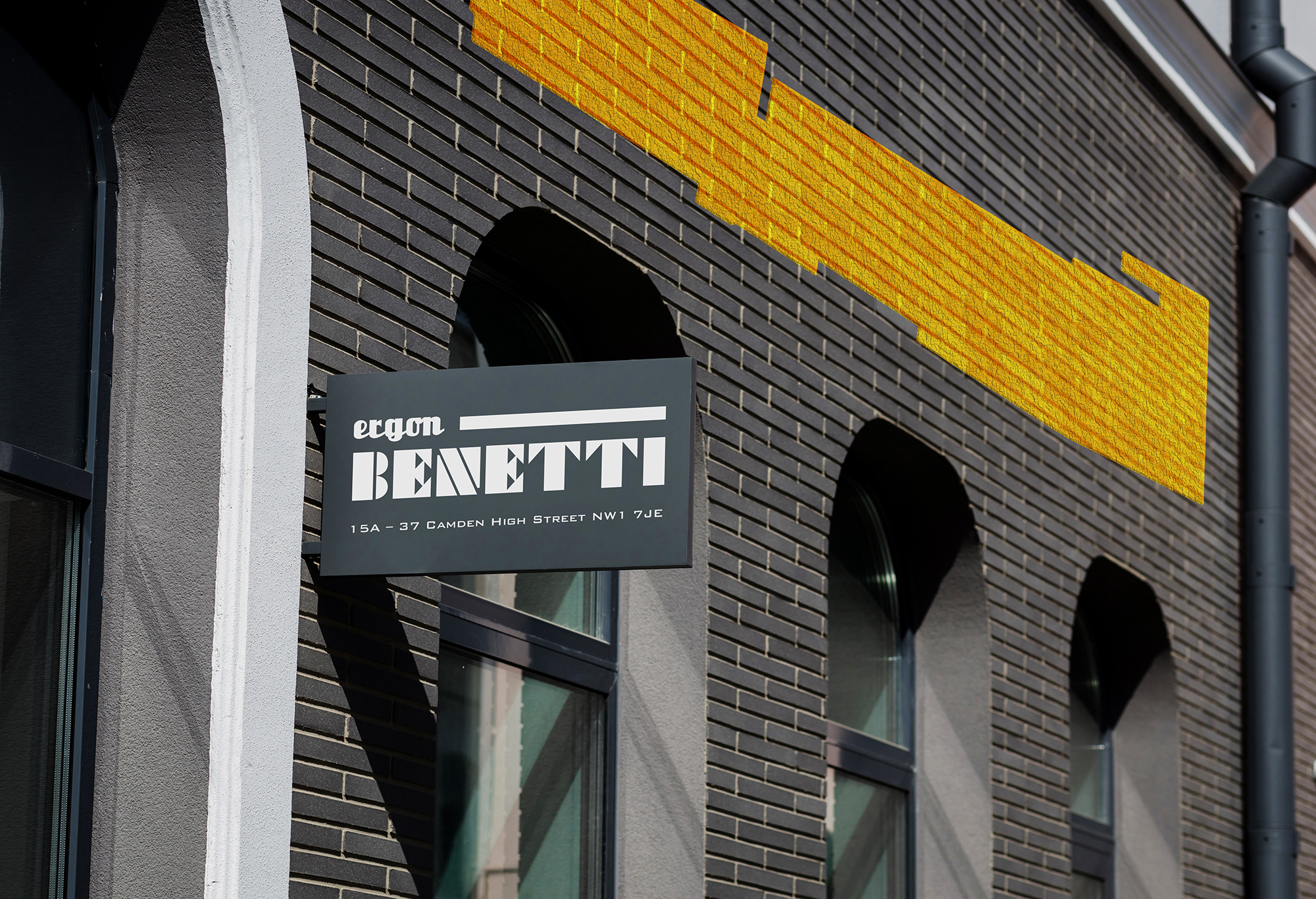
ergon BENETTI is a multiplex creative space on Camden High Street, shaped by the architectural character and cultural history of its surroundings. The identity originates from the building’s own floor plan, transformed into a bracket-like symbol representing unity and togetherness. This form becomes a flexible graphic and spatial device, supporting a 360° visual system that reflects inclusivity, diversity, and the bringing-together of people, practices, and creative disciplines.
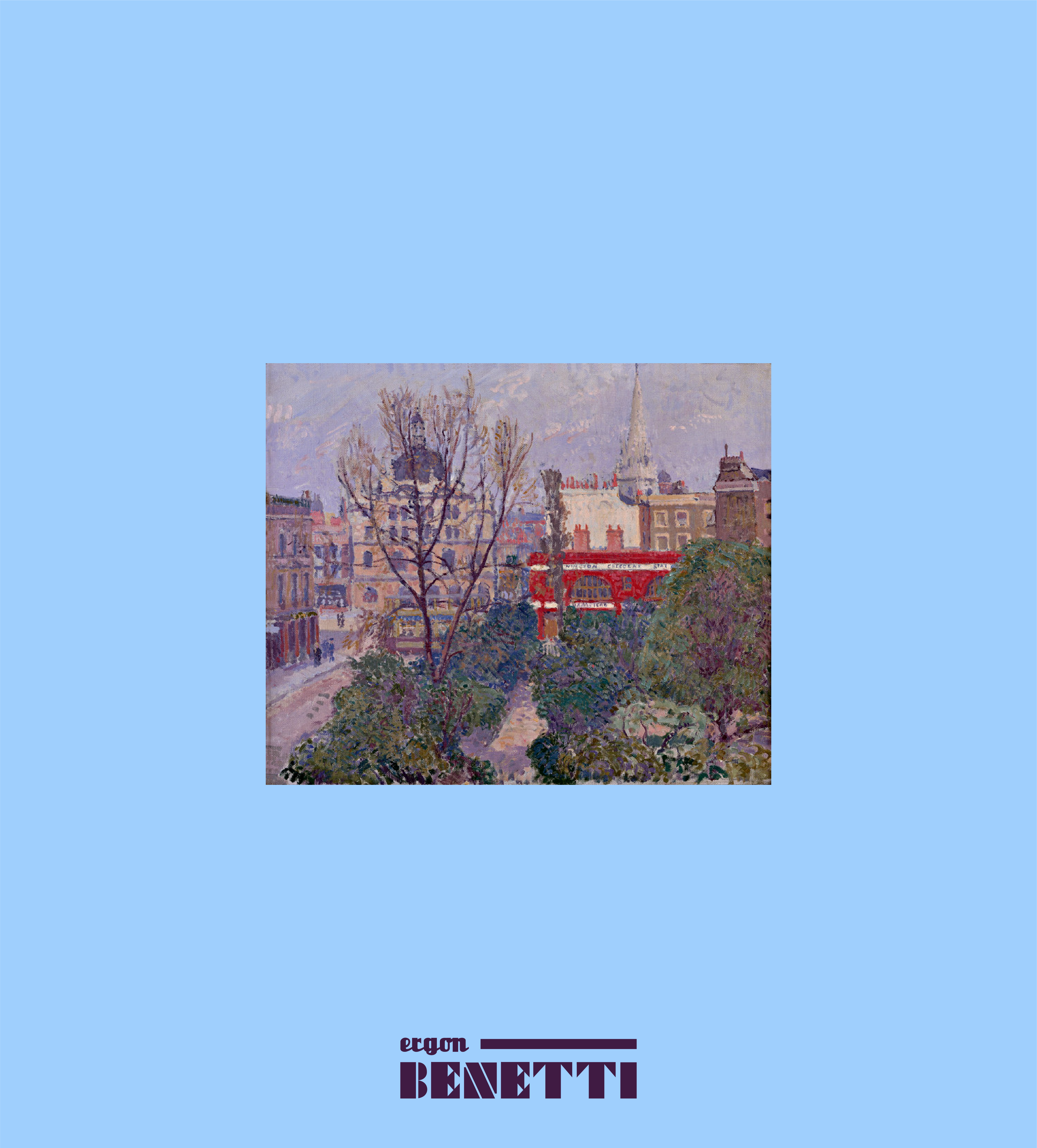
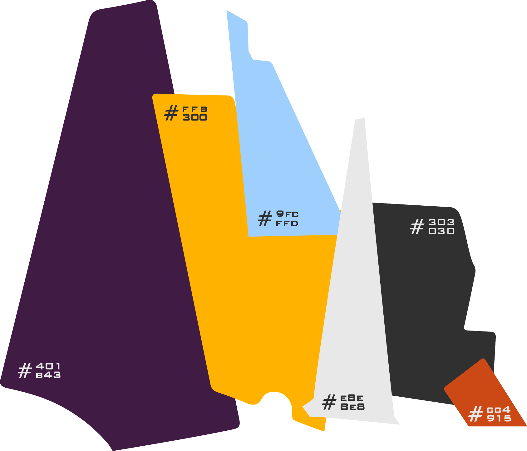
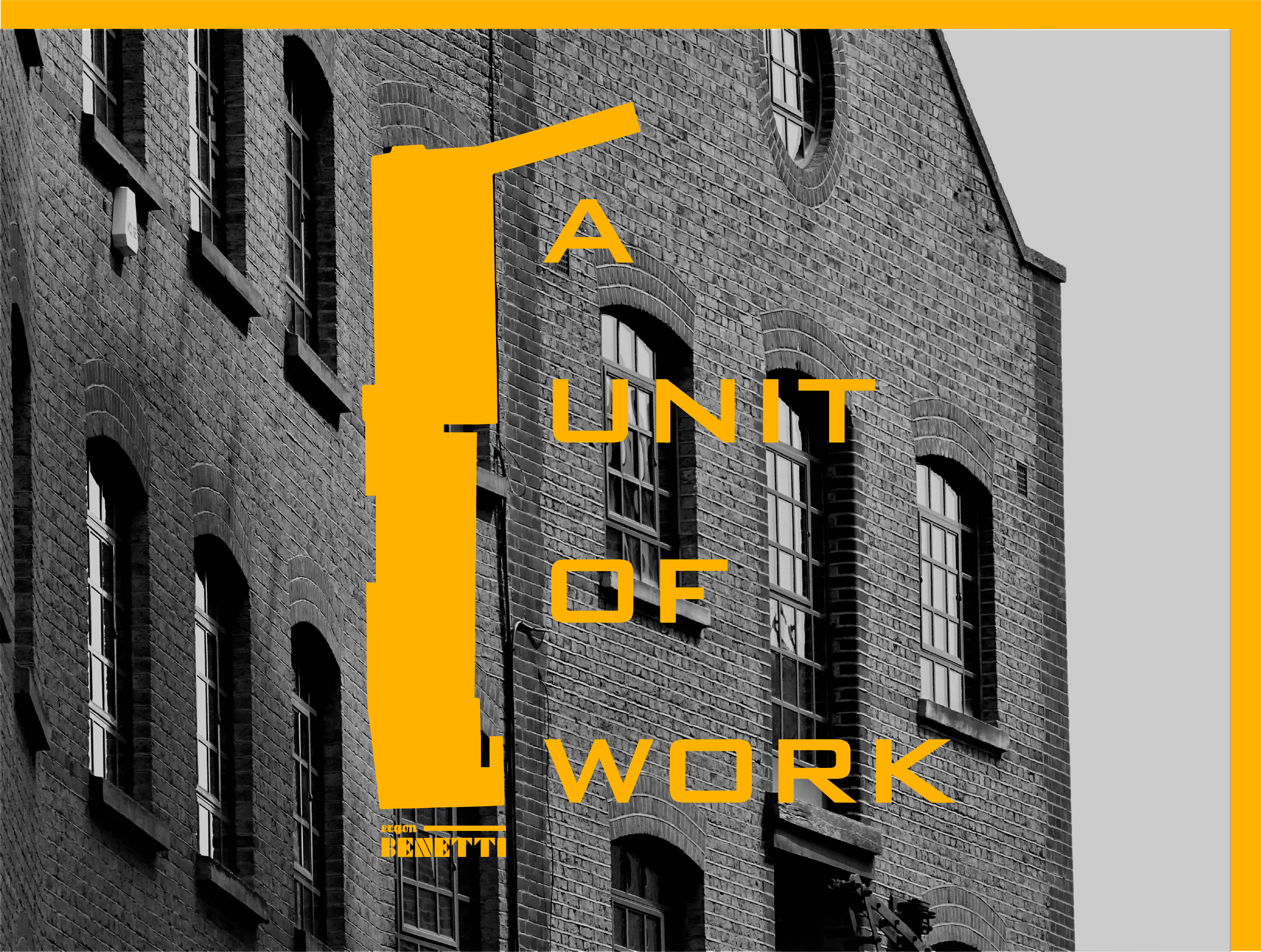
Drawing from Camden’s layered heritage, shaped by migration, reinvention, and the presence of writers and artists, the brand acknowledges the area’s longstanding cultural vibrancy. The typographic palette strengthens this narrative, with fonts selected to reflect structural precision while evoking local murals and visual textures. The names “ergon” (“a unit of work”) and “Benetti” (“Bedford New Town Terra Incognita”) reinforce themes of craftsmanship, identity, and transformation.
The visual language is grounded entirely in the building itself, using elevations, proportions, materials, and structural details as primary design elements. This produces an identity that is both authentic and timeless, avoiding decorative additions and instead celebrating the integrity of the space. Applications across print and environment highlight the building’s unique character while positioning ergon BENETTI as a new creative landmark for the community.
Filed under:
Branding
Branding
















PWF
2023
2023
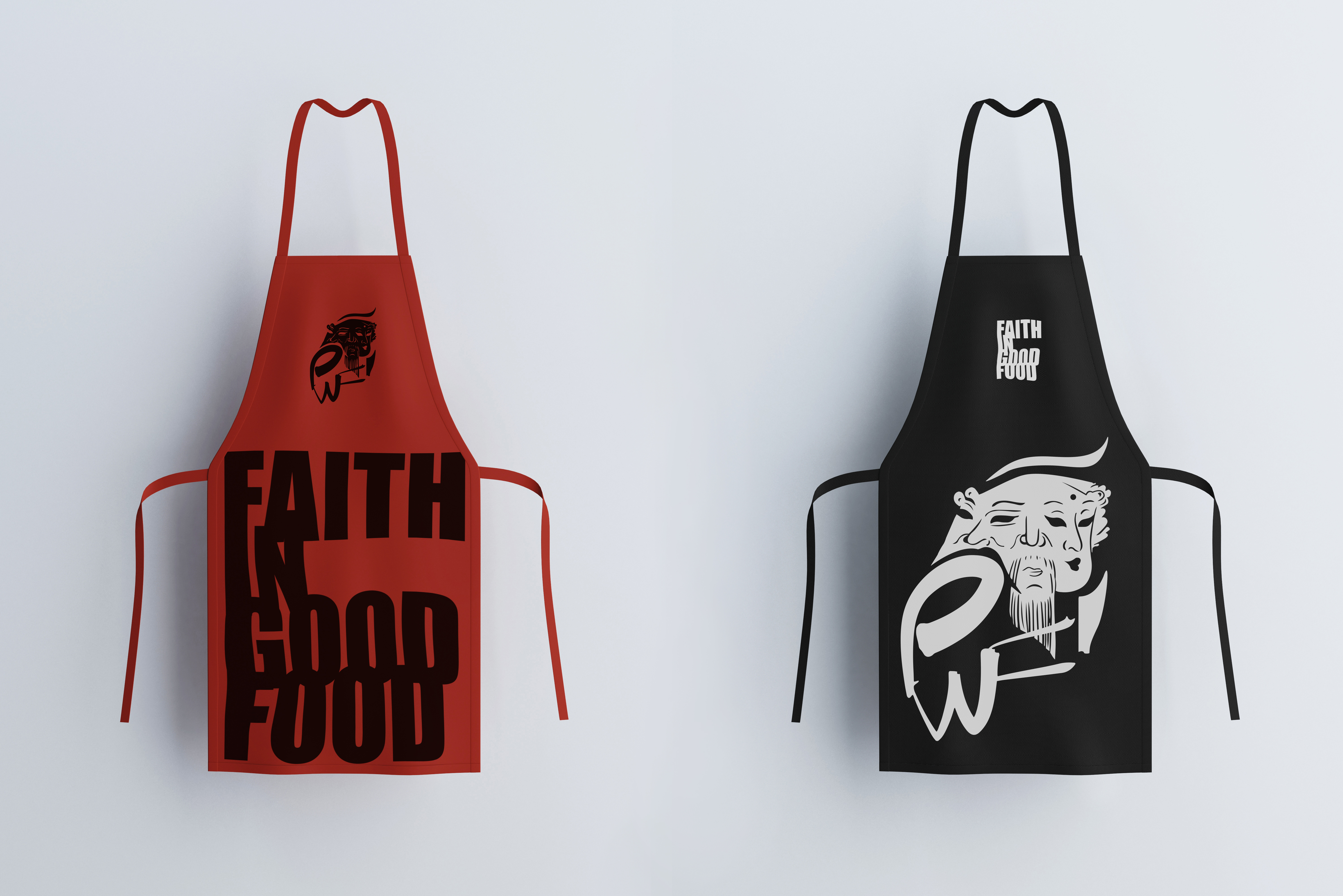
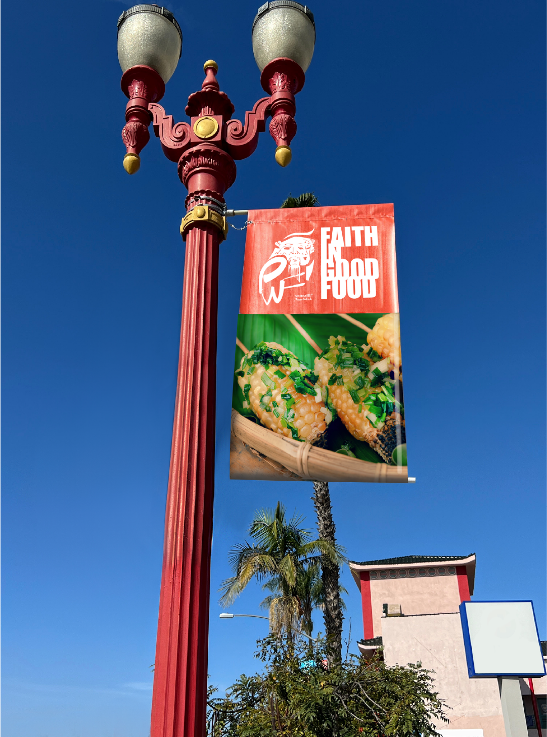
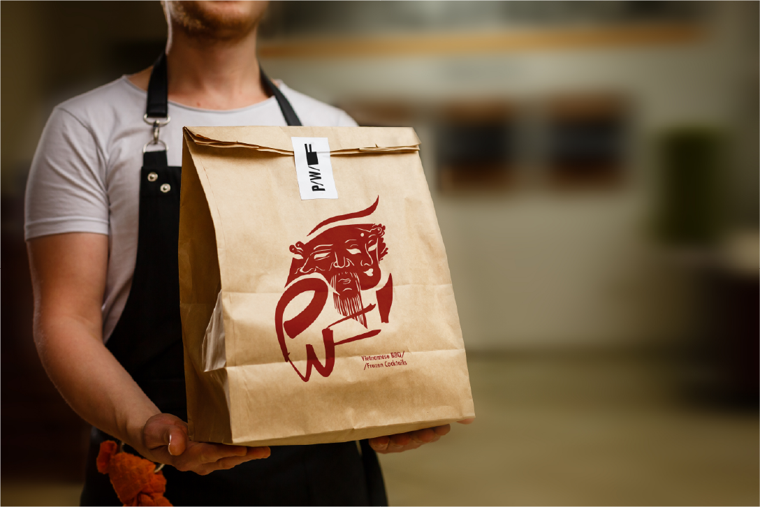
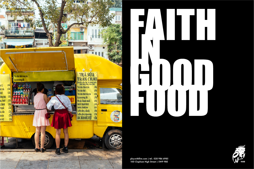
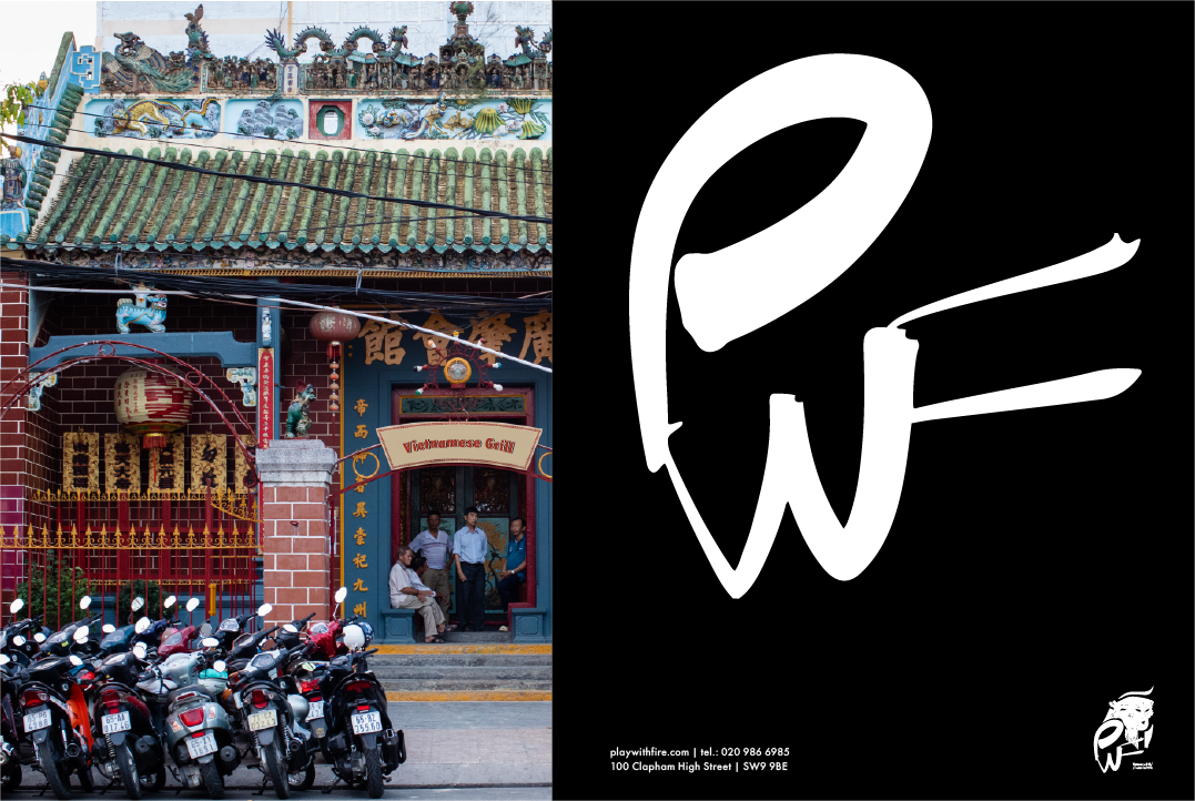
Revisiting the heritage of an original Vietnamese restaurant from Hanoi, “Nướng Và BBQ,” and reimagining its story for its new chapter in London. Rooted in a family tradition dating back to the early 1980s, the brand draws from the symbolism of Ông Táo, the Vietnamese Kitchen God, whose presence represents protection, domestic harmony, and the heart of the home. Archival references, including traditional 3-in-1 deity illustrations and cultural imagery, informed the narrative direction and grounded the identity in authentic Vietnamese folklore.
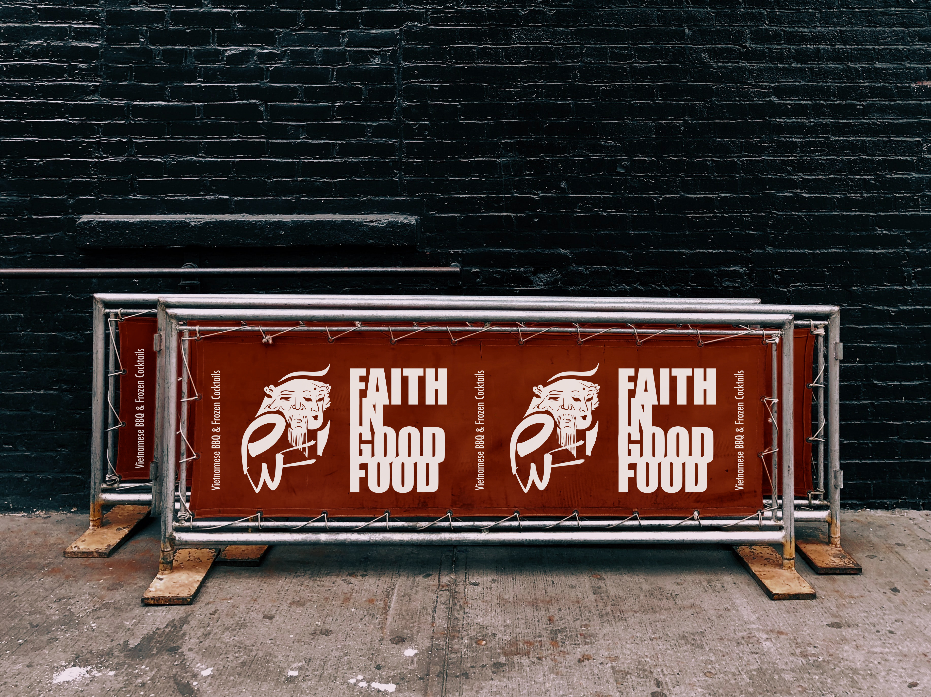
The design process began with restoring and digitising the existing deity artwork found in the original restaurant. While the full illustration proved too intricate for a modern application, it inspired a distilled, minimal composition focusing on the three heads, each preserving layers of cultural and familial meaning. A handwritten name, “PWF” (Play With Fire), ties back to the restaurant’s origins in grill and barbecue cuisine, embodying both the warmth of the kitchen and the playful energy behind the brand’s story.
The tagline “FAITH IN GOOD FOOD” reflects the belief in food as a unifying force, echoing both personal values and the rhythm of Vietnamese home cooking. Colour choices reference the palette of the original Hanoi establishment, while a blend of Asian minimalism and European influence aligns with the fusion menu, while the typefaces introduce a confident, contemporary expression for the brand’s London evolution.







PREEZE
2023
2023
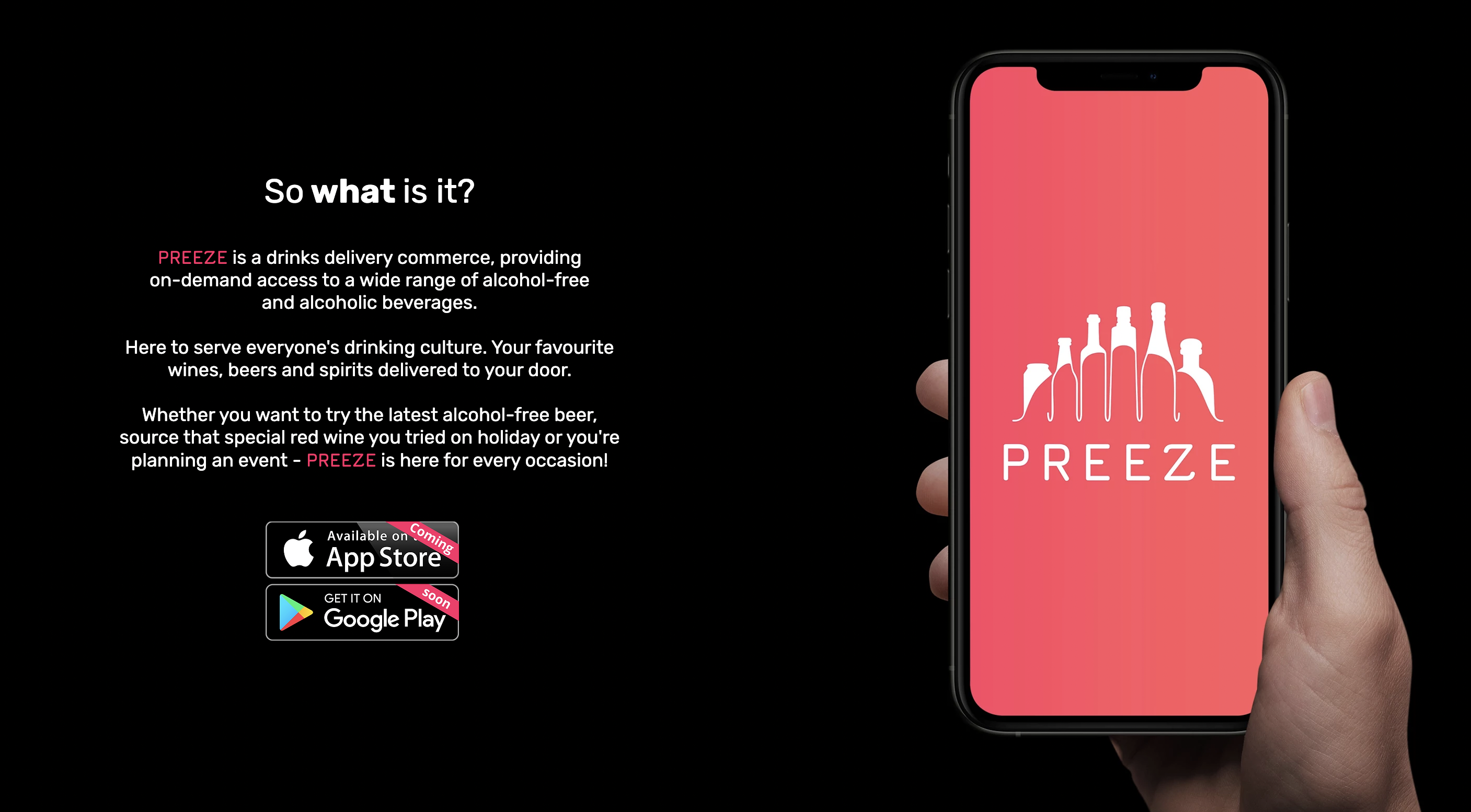
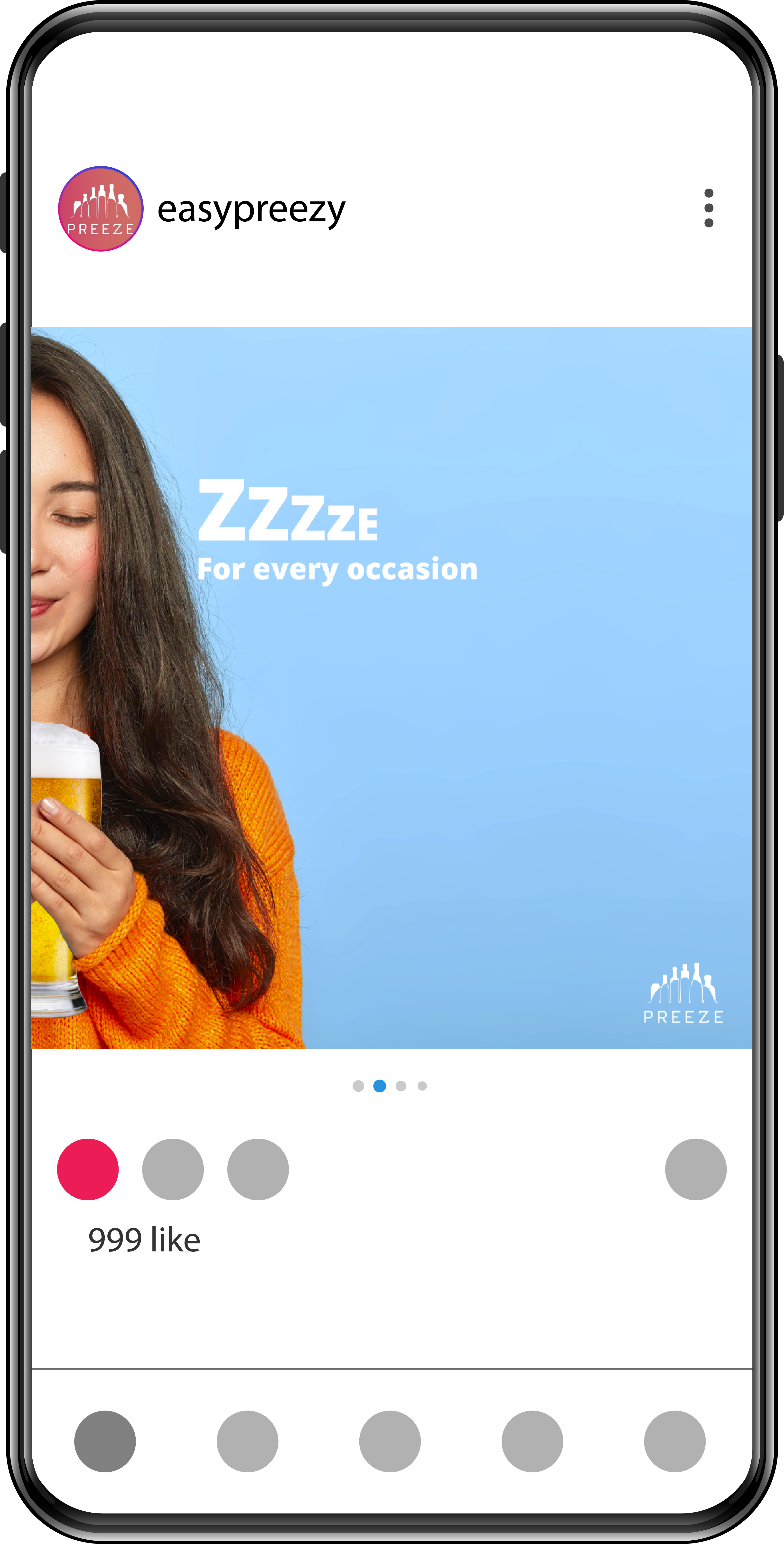
Preeze was an innovative drinks-delivery service that required a refreshed and more contemporary visual identity.
The project began with an update of the existing logo, refining its form to better capture the brand’s energetic and on-demand spirit.
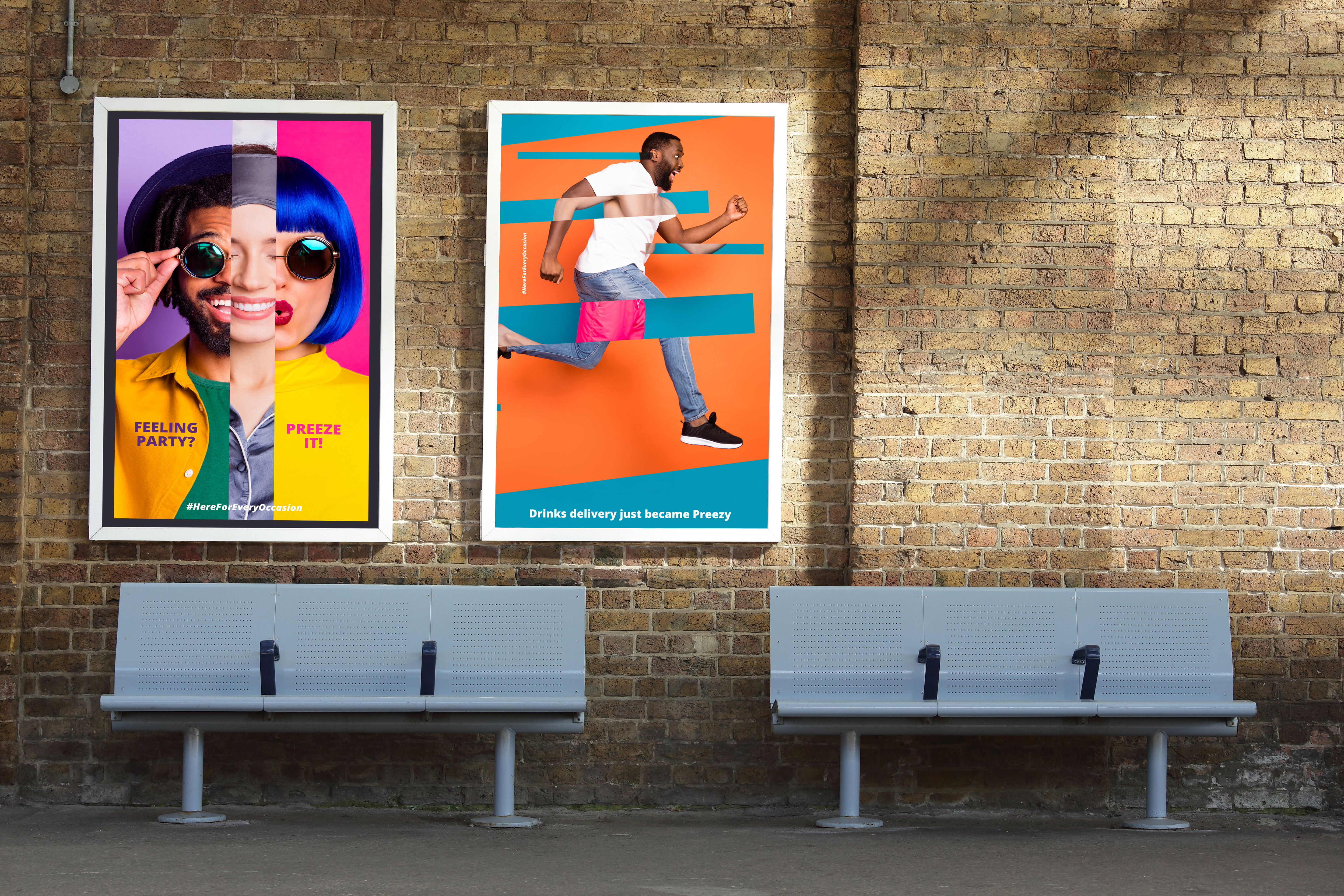
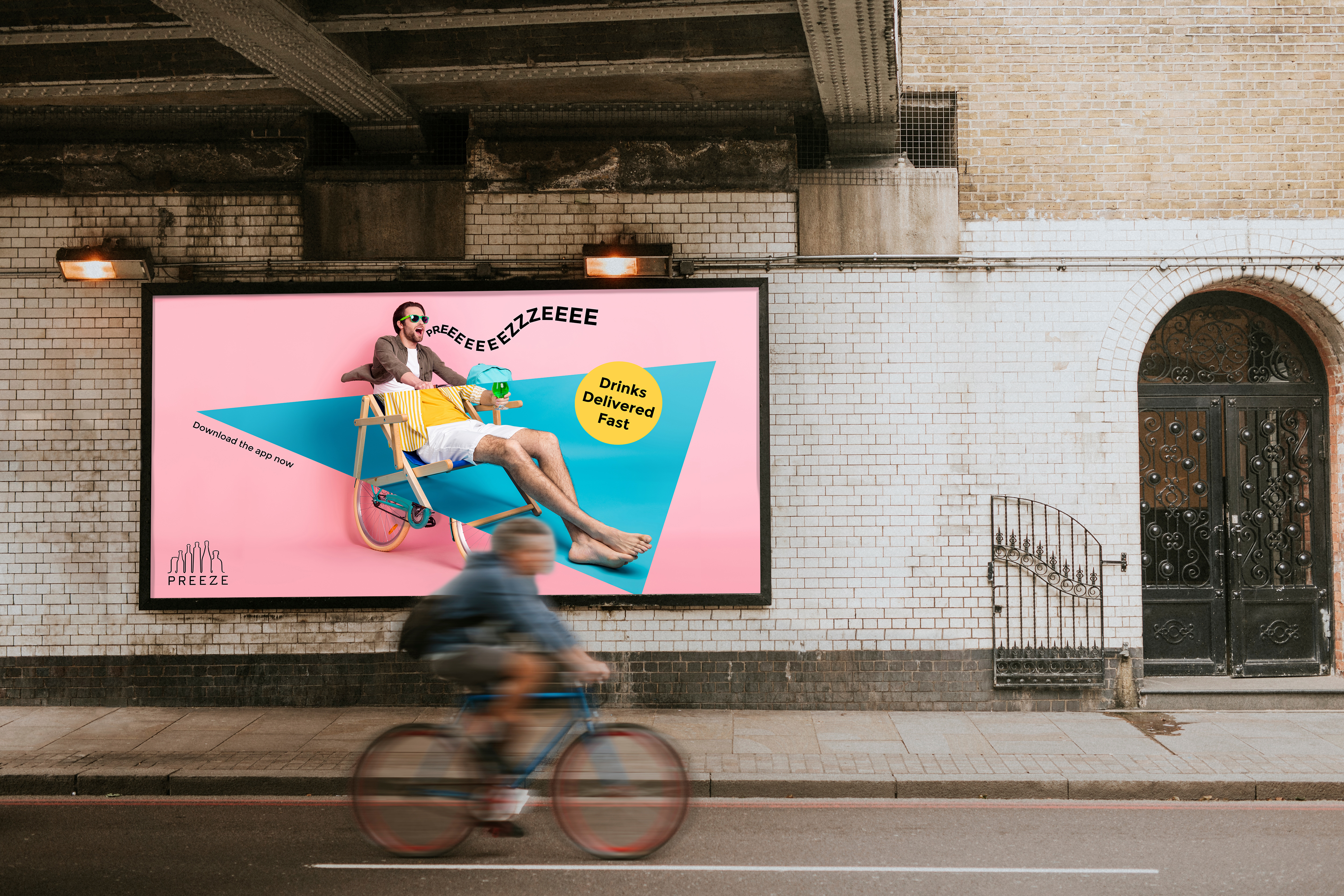
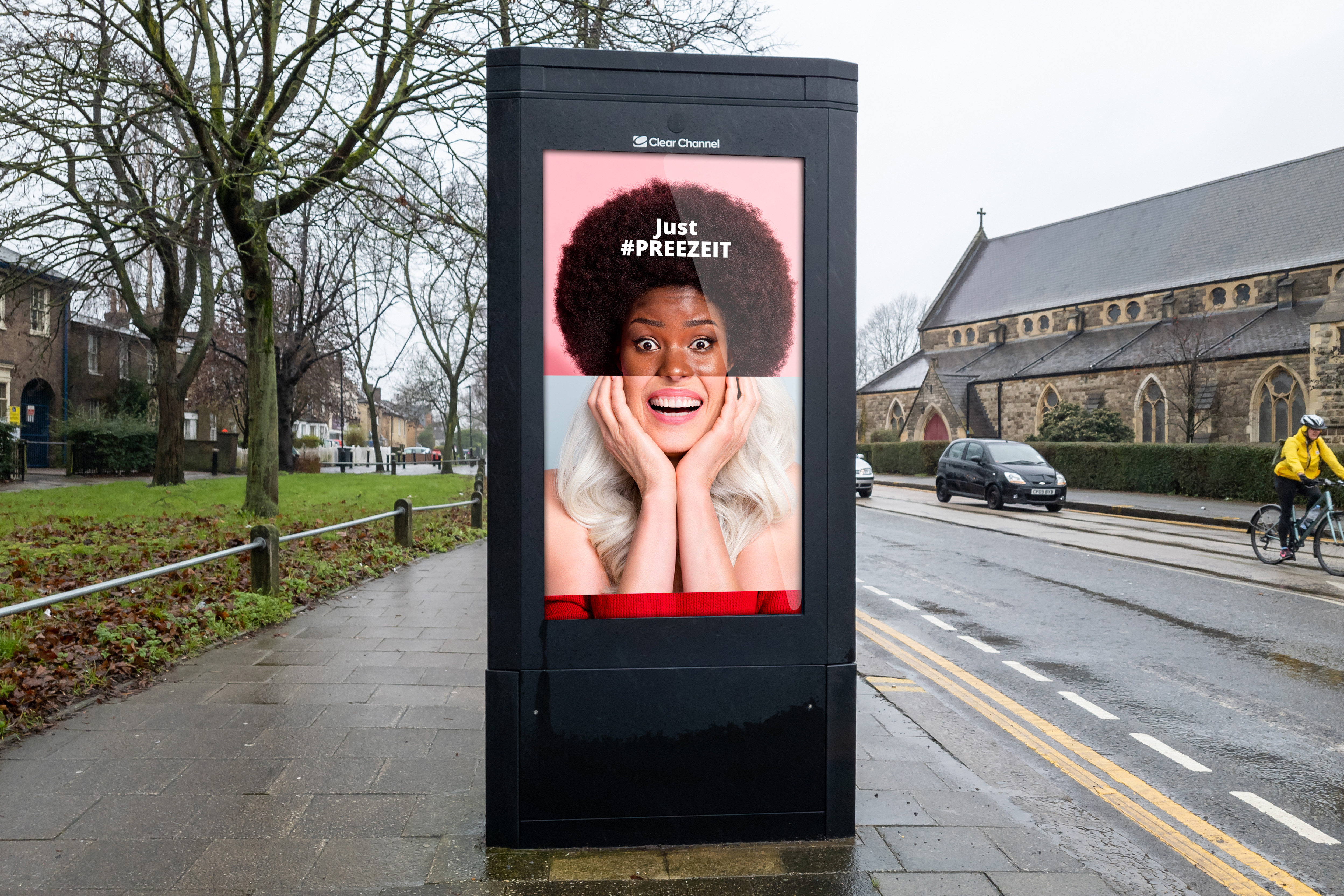
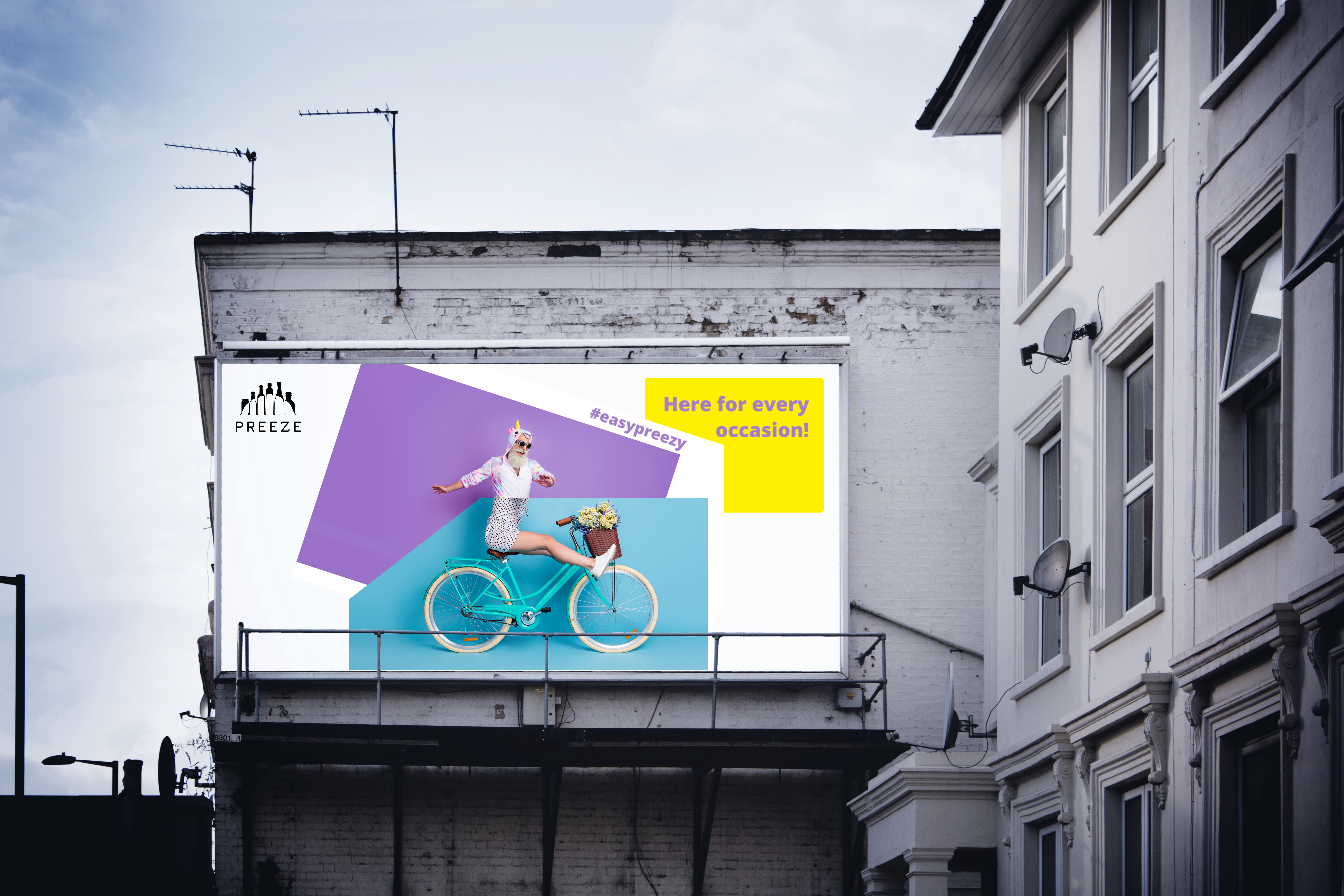
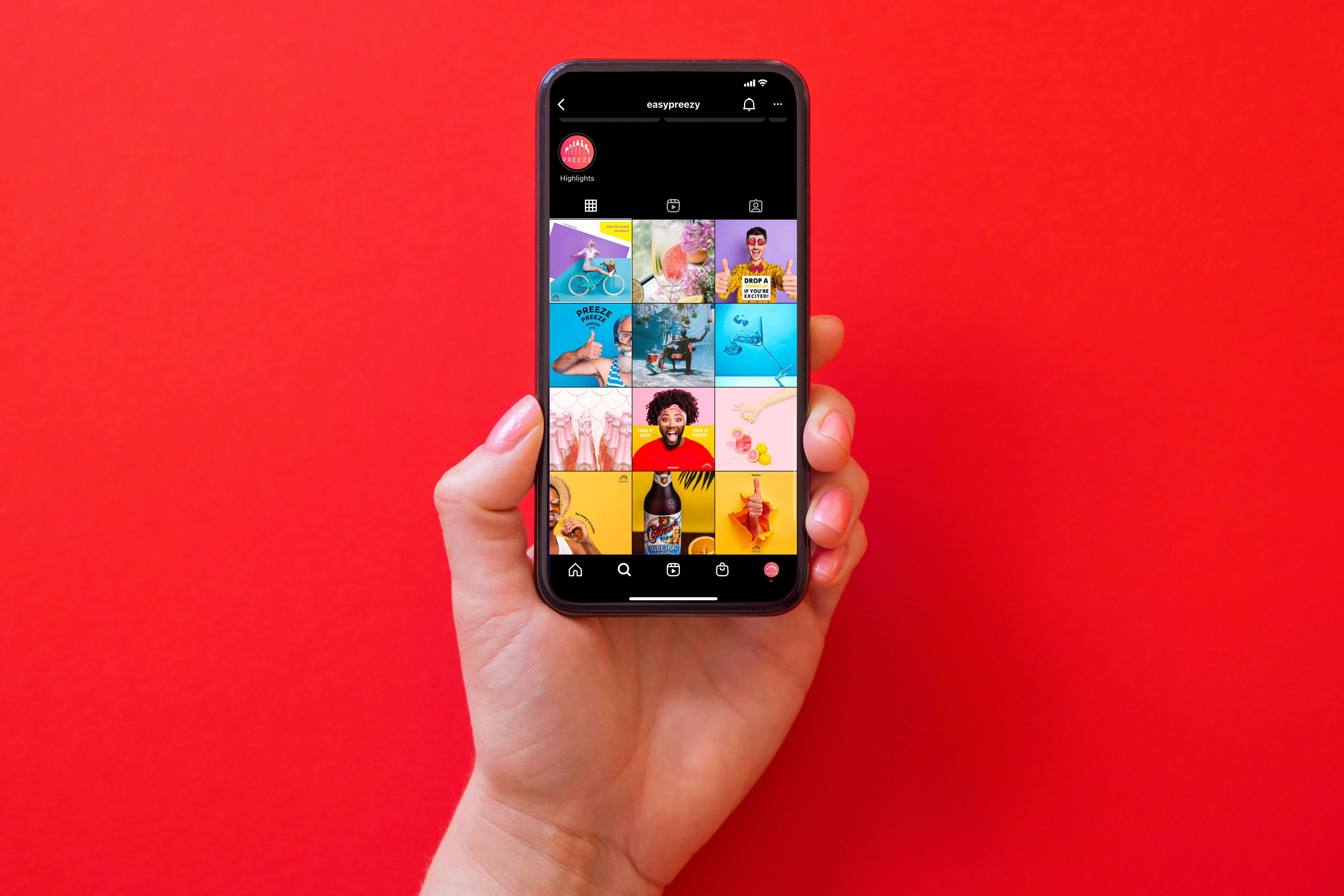
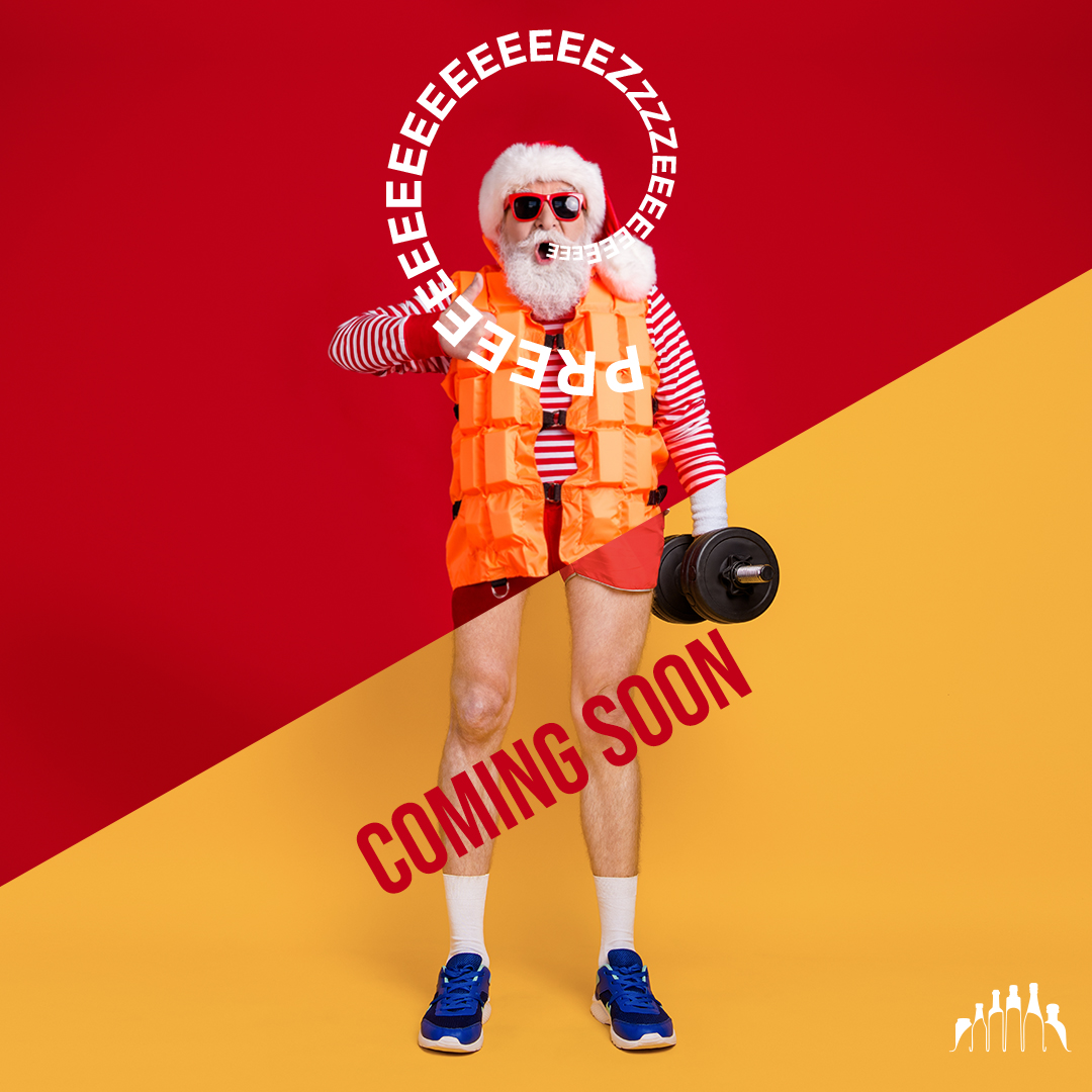
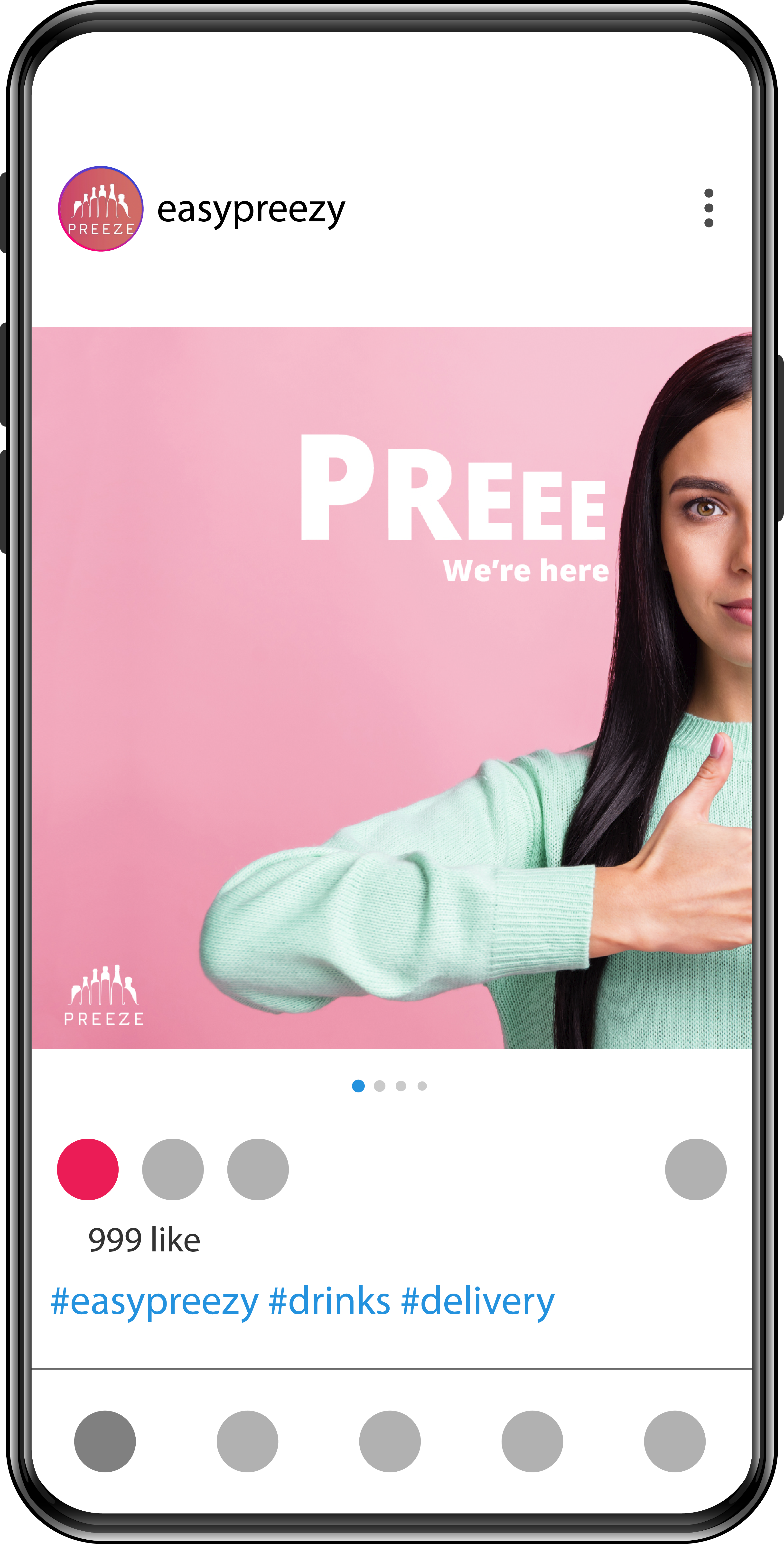
Following the rebrand, a full suite of promotional materials was developed, including a cohesive set of Instagram posts designed for high-engagement social campaigns, as well as large-scale billboards and street posters crafted to strengthen the brand’s presence in public spaces.
Together, these deliverables established a bold, modern, and instantly recognisable identity for Preeze across both digital and urban environments.
